Your First Look At Ranveer Singh’s Batman-Inspired ‘Gym On Wheels’
- 20 Jun '22
- 8:51 am by Nuriyah Johar
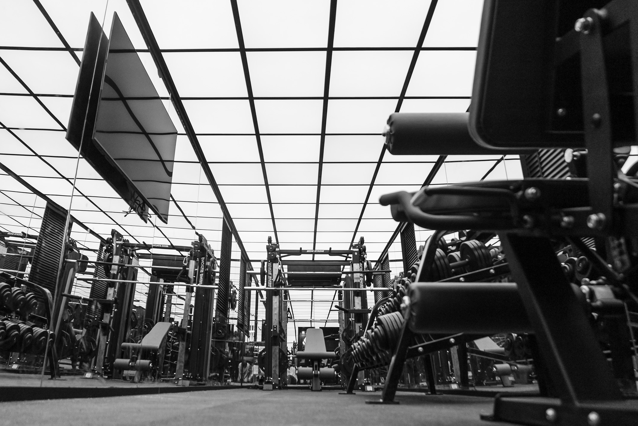
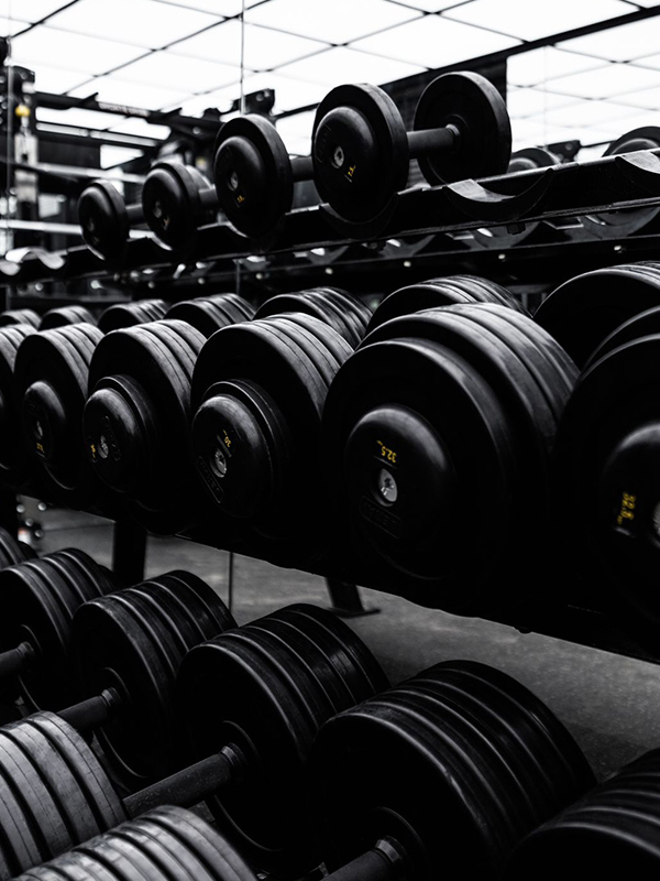
“Absolutely minimal!” Ranveer Singh’s succinct design brief for his ‘gym on wheels’ was, curiously enough, a stark foil to the film star’s maximalist personality. Monochromed to perfection with sleek mirrored walls and an infinite ceiling of light, the space feels less like the interior of a caravan and more like an ultramodern sanctum; which is fitting, given celebrity designer Rupin Suchak’s inspiration for the interior. “Standing in the space during construction, we were struck by the set-like quality and its closeness to Batman’s garage in The Dark Knight,” he tells us. “As clichéd as it may sound, I wanted to give Ranveer a feeling of a superhero when he worked out.”
Rupin is a growing favourite amongst Bollywood celebrities. He started off in film production design, and as natural progression would have it, took on the mantle of interior designer for actors like Alia Bhatt and Sonakshi Sinha whom he worked with on set. His design portfolio spans residences and offices, vanities and movie sets, and yet, this has been his most experimental undertaking to date. “It’s something that’s never been done before, because we don’t have a caravan culture in India, apart from celebrities using them as vanities,” he says. Rupin and Ranveer met just once to exchange ideas on what this ‘gym on wheels’ would look like, after which they kept in touch through occasional zoom calls. Rupin adds, “the second time I met him was on the delivery day when he had just flown down from Abu Dhabi straight to Filmcity for his shoot!”.
“This van is meant to travel across the country for shoots, and so I had to use my production design experience to help me break the stereotypes of a regular execution” – Designer Rupin Suchak
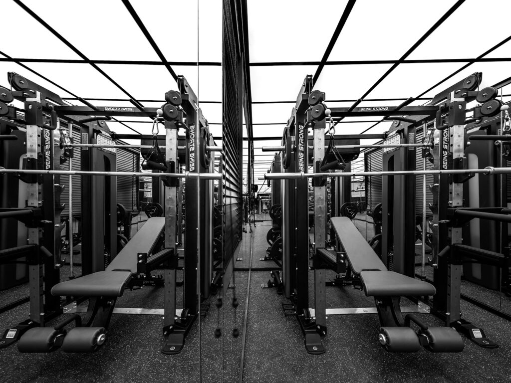
The space itself is layered in its intrigue. On the surface, it is a striking play of light and reflection, made especially distinctive by its deliberate lack of colour. A deeper exploration, however, reveals an admirable level of technical prowess backed by creative thinking. The gym is a structural marvel; featuring everything from bespoke attachment systems to protective layering. “This van is meant to travel across the country for shoots, and so I had to use my production design experience to help me break the stereotypes of a regular execution,” Rupin explains. To keep the mirrors from breaking on Indian roads, Rupin designed what he called a suspended double sandwiched silicon mirror system, with a foaming back that was attached to the ply base on the walls. Every piece of gym equipment was bolted to the chassis of the vehicle, and then additionally fixed to avoid any rollover. Furthermore, the weight was divided and calibrated with the flow of workout and storage spaces. Rupin also created a layered, rubber and silicon floor for maximum shock absorption.
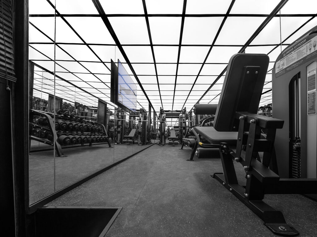
Another noteworthy aspect of the design is the illusion of space it provides; undoubtedly, one of Rupin’s set design secrets comes into play here. In a compact area of around 350 square feet, he brought forth a feeling of boundlessness. “There was a sequence of events during the design process: we were always trying to achieve a continuous ceiling of light and a mirrored back wall to give the impression of infinity as the space was too small.” For the ceiling, Rupin incorporated a dimmer-based lighting system, and a minimal grid fitted with high-intensity LED based channels ran throughout. The grids were then covered with a Barrisol stretch ceiling to lend a seamless finish. “Our focus was on how beautifully we could light a human body that’s working out in that space, and highlight every detail,” says Rupin. “I don’t think there is any industry that explains the lighting of a human form better than the film industry, and I happen to be an integral part of it,” he goes on to add. According to him, the best way to observe a physique for muscle study is against a black backdrop, under white light at a colour temperature range of 3500k to 4200k. As is evident from the starkly monochromatic visual language of the space, he saw that brief to fruition.
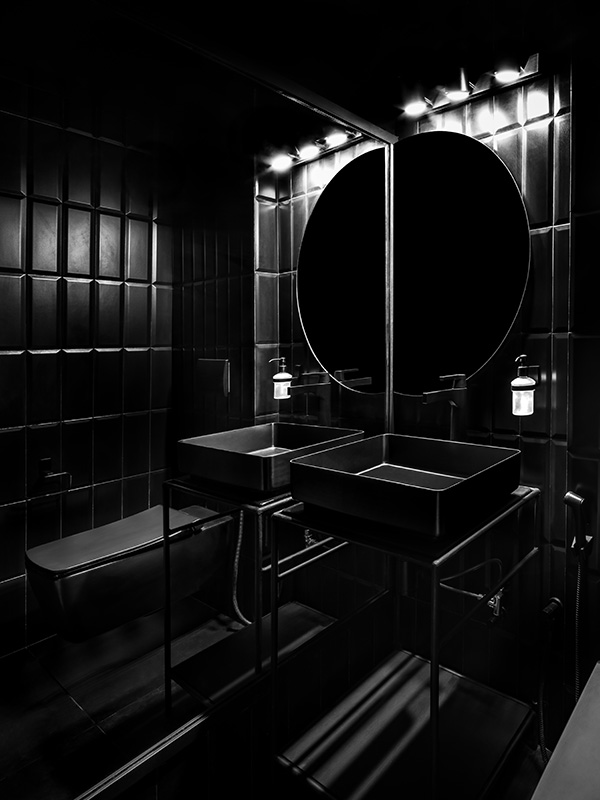
An all-black bathroom completes the mobile gym. Clad in sleek, matte-black tiles and finished with fittings from Bocchi & Brizo, the bathroom exudes the same kind of cinematic drama that characterizes the rest of the space.
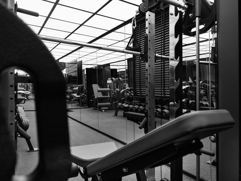
Ultimately, this ‘gym on wheels’ is a compelling product of the nuances of interior and set design layered with an expert understanding of technical construction. It transcends the formulaic popularity of celebrity interiors, appearing instead, as a singularly noteworthy space all on its own.

