Unexpected Red Theory: The Power Of Using Hues Of Red In Home Design
A pop of unexpected crimson can alter a space, infusing boldness, drama, and verve. Discover how this unexpected design trick brings style with a side of flair.
Red is a hue associated with love, luck, danger, and rebellion across cultures. The impact of red? Have you ever walked into a room and your eyes drawn to a single red chair or spotted a rogue red brushstroke in an otherwise calm painting? This is no accident—it’s the ‘Unexpected Red Theory’ at play. Amidst the whirlwind of microtrends, cores, and strategic memeification on TikTok and Instagram (for Indians), this enchanting idea has recently begun making rounds, effortlessly slipping into the design trends. Unlike the fast-paced churn of fashion trends, design trends unfold with measured intent, gradually shaped by craftsmanship, permanence, and the time taken by the artisans.

The Unexpected Red Theory first started appearing when creators pointed out how a single red object in an otherwise neutral or monochrome space could command attention. This theory explores red’s power to guide the viewer’s eye by mastering the art of deliberately infusing it in places to create visual narratives. It’s a reminder that even in the most controlled spaces, a hint of the unexpected can transform a design.
Also Read: #DPExclusive: This Mumbai Home Is A Masterclass In Shape, Light, And Colour
Origin Of The Scarlet Effect

Red is more than just a hue—it holds centuries of cultural weight. In China, red signifies luck; in India, purity and passion; in the West, romance and power—each culture weaving its legacy of scarlet splendour. Regardless of its timeless allure, red is one of the oldest pigments in human history, brushed into the very fabric of civilisation, with a legacy painted in bold, unmissable strokes.
The earliest traces of red pigment date back over 40,000 years, with ancient artists grinding red ochre (an earth pigment composed of clay, sand, and iron oxide) to paint vivid scenes on cave walls. However, this timeless hue evolved, appearing in temples, on kings and cardinals, eventually attaining a spot in Titian and Caravaggio’s paintings as an emblem of passion and power. Consequently, by the 19th century, red became a staple in interior design, from Victorian velvet to Art Deco lacquer, eventually emerging in contemporary times through the Unexpected Red Theory.
Also Read: This Sprawling Mumbai Home Takes Cues From The Neotenic Design Trend
The Allure Of ‘Unexpected’ Red
The Unexpected Red Theory captivates because surprise is a distinct design tool that crafts illusions, making the brain pause, process, and engage. A sudden pop of red breaks the visual monotony, parlaying as a psychological cue for the eye to linger a little longer. As mindless minimalism takes centre stage, one craves a splash of the unexpected. When this contrast—in terms of colour, texture or even shades—channels red’s transmitting power in unexpected spaces, it transforms even the austere spaces into a masterpiece of intrigue and intention.
The Art Of Placing Red Indoors

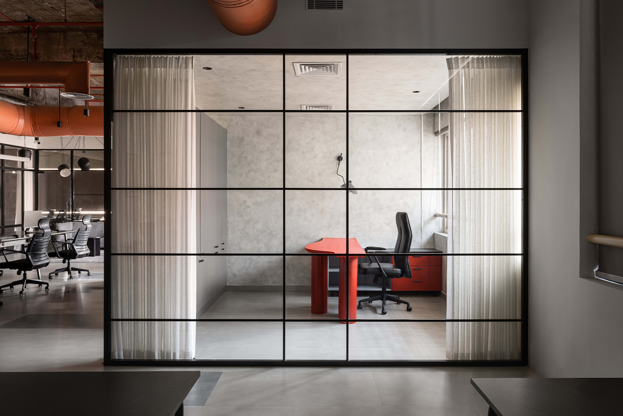
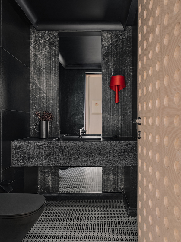
The allure of this theory lies in the colour’s knack to captivate. So ditch the complete red and let a rebellious accent draw the user’s eyes by incorporating red accents in the interiors. Picture petite accessories like bespoke throw pillows, sculptural vases, or chic red candles infusing a pop of red into space, creating a subtle yet striking pièce de résistance. For a softer touch, rich red textiles—velvet drapes, woven rugs, or cashmere throws—can add a touch of the unexpected. This sole red accent in a neutral room establishes depth while simultaneously building a pattern through scattered touches. For a gallant statement, think of a sleek red lamp appearing in a neutral palette, a velvet ottoman, or a lacquered side table injecting warmth while adhering to an avant-garde theme of deliberate.
With its high transmission character when introduced in large areas, red accents possess the innate trait of shifting the atmosphere and amplifying emotional response. A crimson-painted bookshelf interior adds a plot twist to an otherwise austere shelf, while a red ceiling flips an ordinary room into a maximalist statement, guiding the eye upwards. The red trim around the doors whispers architectural charm, transforming a simple design element into a visual landmark that guides the eye while defining transitions. This detail serves as a visual cue, turning a simple passage to the next room into an intentional journey.
Also Read: 7 Iconic Artworks to Discover at the 11th Asia Pacific Triennial of Contemporary Arts

While art inherently commands attention, art with a singular red brushstroke or an abstract piece laced with scarlet tones transforms an austere wall into a conversation starter. Picture Jeff Koons’ playful sculptures, Damien Hirst’s striking compositions, or Gerhard Richter’s emotional depth. Eminent for its ability to stimulate appetite and energy, red is a perfect choice for dining spaces. Instead of a predictable red dining table, indulge in a more unexpected touch for home décor—think deep red chairs, a woven runner, or a vase brimming with crimson florals, each an effortless reminder of a theory at play.
Also Read: At Nikhil Kamath And Abhijeet Pai’s Bangalore Office Cultural Craft Meets Contemporary Design

Mastering The Art Of Colour Collisions With Red

The unexpected red theory thrives only when thoughtfully surrounded by complementary hues. As a visually arresting colour, red stipulates a careful balance to avoid overwhelming a space. Pairing this hue with neutrals—pristine whites, soft greys, or warm beiges—allows its vibrancy to be the focal point without overpowering the room. Meanwhile, earthy tones like terracotta, mustard, and olive greens seamlessly subdue red’s boldness while evoking a cosy, inviting vibe. Further, the coolness of deep blues and rich greens contrasts with the red’s bright warmth, creating a serene sense of calm and balance. These meticulously curated blends elevate the mood of each room, striking a delicate balance between vibrant energy and serene tranquillity.
Red, in its inaudible audacity, tells a tale of passion and energy, whispering its vibrant language into the room’s stillness. Like a vibrant brushstroke on a blank canvas, it breaks the monotony with its presence, filling the space with warmth and vivacity. As we navigate spaces that can sometimes feel too neutral or too quiet, red, in all its fiery brilliance, is a stark reminder that there is beauty in the deliberate, which makes one ‘pause and wonder’.