A Tribute To The Foremost Design Fair – Down Memory Lane with Salone Del Mobile, Milan

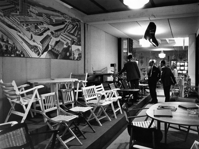
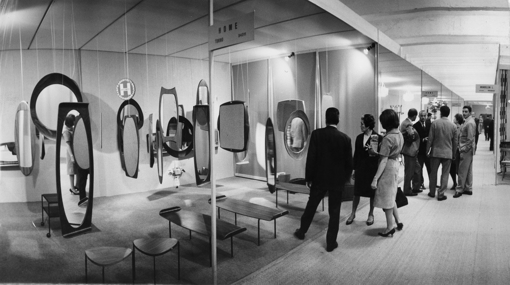
In 1961, the Salone Del Mobile made its first-ever its first appearance in Milan as the brainchild of a small group of furniture makers. Saturation of internal demand in the wake of the post-war reconstructions suggested exports as a possible outlet, but the small Italian manufacturers were in no position to tackle this on their own. However, a trade fair that would attract foreign interest seemed a viable opportunity and Milan, the financial capital of Italy, was identified as the most suitable location. This marked the show’s humble beginning.
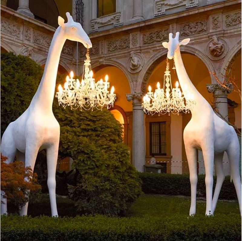
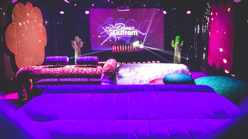
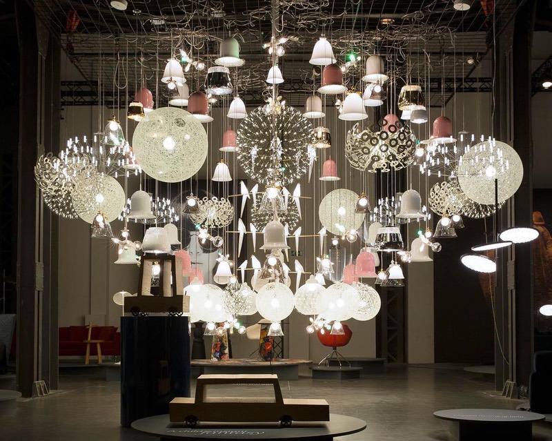
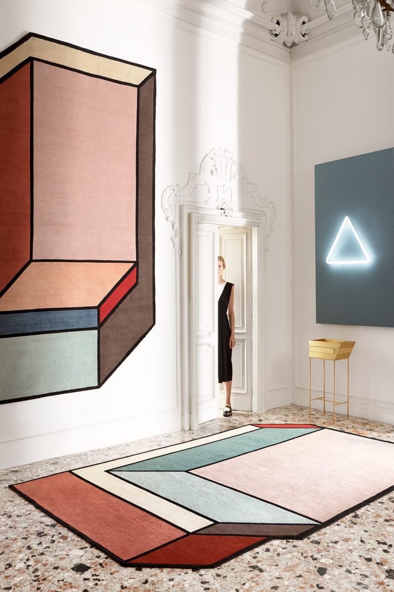
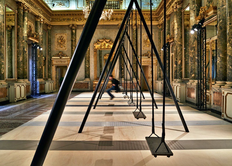
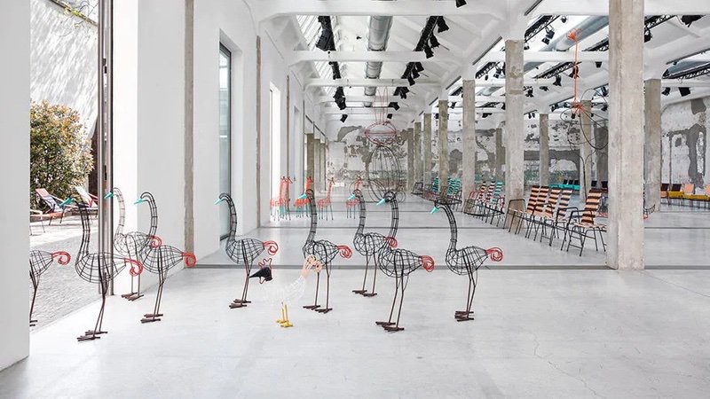
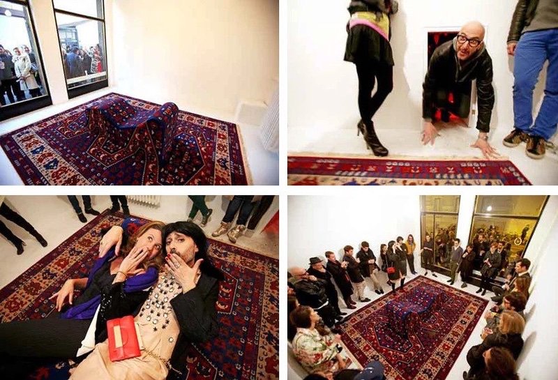
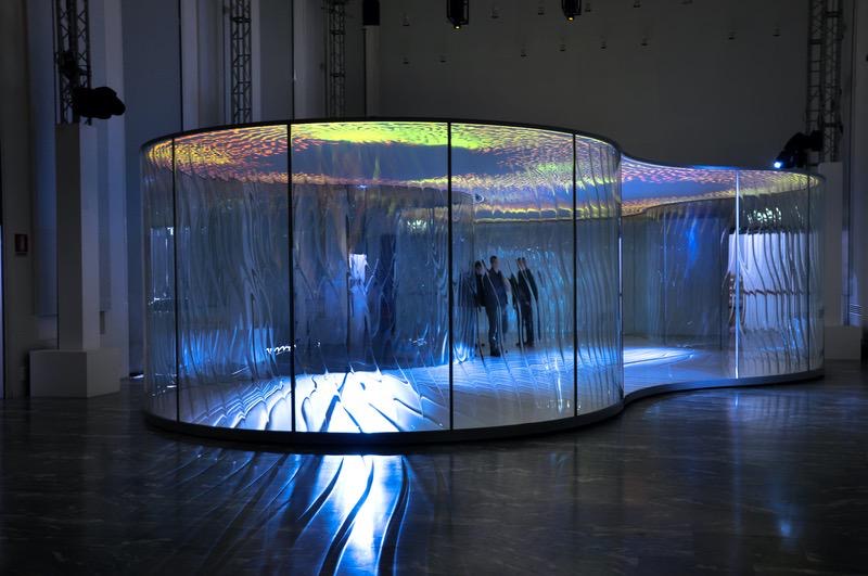
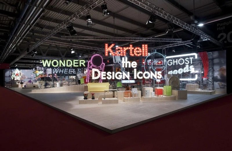
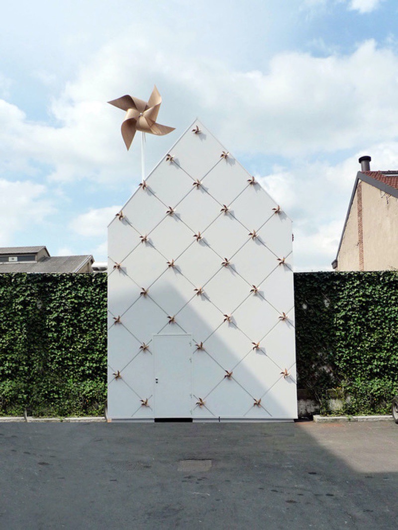
Cut to 59 years later, and Salone Del Mobile is now the most significant design fair in the world. Every spring, designers, buyers, and brands from all across the globe flock to Milan discover what’s new in the design world. Salone is indisputably the biggest event of the year, kickstarting the design calendar and setting the tone for the months that follow. The year 2020 however, tells a different tale. Italy was hit catastrophically hard in the early months of the COVID 19 pandemic, resulting in Salone Del Mobile getting postponed, and then cancelled for the year altogether. As the virus spread, most design shows and events across the globe followed suit. Design Pataki attended the press conference for what would have been the 59th edition of the Salone del Mobile in February, with great anticipation for the fair. Now, we can only wait for the fair to return with a bang in 2021. Since well over half a century, The Salone del Mobile has been synonymous with enduring success, symbolising a way of working and interpreting modern industry. As our tribute to the pioneering fair, we’ve rounded up the most iconic displays, standalone products and collections presented at Salone over the last ten years. 2019 – Qeeboo, Giraffe In Love Next-generation brand Qeeboo’s showcase at Salone’s 2019 edition may have been modest in scale, but was thoroughly compelling in its designs. The collection featured products by the brand’s founder Stefano Giovanni, Dutch/Belgian firm Studio Job, and noteworthy Italian designer Marcantonio. Though not exclusively a lighting brand, it was Qeeboo’s lighting, more specifically Marcantonio’s “Giraffe in love” which became a crowd favourite at the fair and subsequently went viral across social media. The product features a dreamy giraffe manufactured in polythene, holding a classic Marie-Therese style chandelier. Teaming a modern giraffe sculpture with an anachronistic chandelier reflected an unconventionality characteristic of the brand. 2018 – Gufram, Disco Gufram A veritable icon of Italian Radical Design, the luxury brand Gufram reimagined the classic discotheque which has been a space intertwined with pop culture since the mid 1960’s, with contemporary objects. This was a collaboration with Milan-based studio Atelier Biagetti, Dutch designers Rotganzen, and Paris-based GGSV. The vibrant collection included patterned carpets that took cues from the geometry of dance floors, seating inspired by Gufram’s upholstered “disco seats” from the seventies, and a series of coffee tables and cabinets that feature warped, dali-esque disco balls. 2017 – Moooi, Size Does Matter! Moooi’s 2017 booth was a remarkable world of attention and detail. The Italian brand lit up the fair with a fantastic chandelier of 161 lamps that sparkled together. Titled “Size Does Matter” the lighting sculpture featured a unique selection of lamps from the Moooi collection, including the iconic Perch and Lolita lights, as well as new products like the Meshmatics chandelier by Rick Telegaar, Busk lamp by Frank Tjepkema and Luna Piena by Marcel Wanders. Amongst all the splendour and beauty at Salone, Moooi’s “Size Does Matter” installation stood out as an explosion of beauty and creativity in the classic form of a chandelier. 2016 – Patricia Urquiola, Visioni Presented as a part of Spazio Pontaccio’s Credenza collection, Patricia Urquiola’s Visioni rug for cc-tapis was a contradictory beauty. Striking three-dimensional geometric form and abstract graphics were met with soft tones and delicate pastel shades. The rugs were produced solely by hand in Nepal with colours and materials that testify to the desire to give value to ancient production techniques. Even today, despite the protean nature of trends and design, Patricia Urquiola’s rug has stayed with us fresh in our memories. The rest of the Credenza collection comprised small furniture containers, screens and low tables, the functions of which were not only to contain and furnish but to enter into a relationship with the space and create a new presence. 2015 – Philippe Malouin, Caesarstone Swing Set A sense of anachronistic beauty characterized Philippe Moulin and Caesarstone’s larger than life swing sets at Salone. Starkly modern and minimal, the swing installation was set against the extravagant neoclassical backdrop of the Palazzo Serbelloni. Malouin created a line of eight swings hung in a line from ropes attached to a thin steel frame, presenting the different colour varieties of Caesarstone – a synthetic stone more commonly used for kitchen worktops. According to the designer, Caesarstone is an extremely versatile material that is easy to predict and work with. Supported by angled posts, the swing set spanned the length of the historical hall, adding an interactive sense of fun to an otherwise sublime structure. 2014 – Marni, Animal House Giraffes, ostriches, rabbits, ducks, donkeys and flamingos made from colourful PVC and metal featured alongside vibrant furniture at Marni’s “Animal House”, as a part of the fashion brand’s charitable initiatives. Handcrafted by Colombian women, this limited edition collection presented distinctive pieces assembled in varied combinations. The theme of the collection was “asymmetry” and on display were traditional chairs with armrests, while others only had one set either to the left or right; alongside low tables, benches, rocking chairs and chaise lounges to create a cohesive look. 2013 – Fabio Novembre, Lapsus Italian architect Fabio Novembre made waves in 2013 with his eccentric carpet-chaise lounge design produced in a limited edition by Gufram. A “Lapsus Performance” by Novembre took place at Le Dictateur, the gallery run by photographer and professional jokester Pierpaolo Ferrari. Guests were invited to enter a clinical-looking room through a tiny door, reminiscent of Alice in Wonderland. For the performance, Fabio dressed up as his wife and his wife dressed as a skinny little boy. Draped across the chaise, both conversed with their guests about the idea of a “Lapsus” while above them, a motorized swinging light bulb completed the surreal scene. The installation itself, a carpet-covered lounge chair, took inspiration from Le Corbusier’s famous lounge chair design, Sigmund Freud’s infamous shrink sofa and Rorschach’s inkblot patterns. 2012 – Ross Lovegrove, LiquidKristal Pavilion British designer Ross Lovegrove collaborated with Lasvit on an installation that was a fluid juxtaposition of sculpture, art, architecture, light and material science. Introduced at Salone for the first time in 2012, “LiquidKristal” is a high precision heat transfer process of creating organic-like glass panels developed by Lovegrove and Lasvit. A futuristic, 60-sq-m flowing installation was created using this technology, open to exploration by visitors. The walls acted as structural elements resting below the roof and doubled as a screen onto which digital art was projected. The undulating glass panels distorted the flow of the projected imagery, heightening the visual effects of the installation and creating a fascinating play of light and reflection. 2011 – Kartell, Design Icons Kaleidoscopic colours and bold neon signs – Kartell’s eye-catching stand came with clear references to yesteryear travelling circus theatres and retro pop-aesthetics. The Italian company celebrated its Design Icons amidst light, colour and theatricality. As an homage to the circuses, the stand was structured in an amphitheatrical manner, wherein the visitors would ironically seem like performers of the evening, and the products on display, represented the audience. The wooden stand was designed to make exaggerated creaking sounds when walked upon, further heightening the spectacle. From Philippe Starck’s famous ghost chair to Ron Arad’s Bookworm, Kartell’s Design Icons were showcased proudly, in a manner fitting of their renown. 2010 – Nika Zupanc, Gone With The Wind Nika Zupanc’s signature style is beautifully paradoxical, marrying theatricality with minimalism. Her conceptual 2010 showcase ‘Gone With The Wind’ featured a collection of objects inside a blown-up dollhouse structure. The large, quilted building with toy-like veneer windmills served as a frame around her pieces. It also stood as a statement, evoking a sense for nature. With it, Nika Zupanc embraced the issue of responsibility by introducing the elegance and poetry of creative expression into predominantly technical solutions. The structure’s facade was dressed in the unique modular system Qbiss by Trimo. Housed within, were Zupanc’s Black Cherry Lamps, Modesty Sofa & Bench and Konstantin Beta to name a few. They presented a case for new symbolic and emotional readings of design, told through elements of modesty and self-reliance. 