Quiet Cool: A Mumbai Bachelor Pad That’s Contemporary Yet Timeless
- 14 May '20
- 9:30 am by Beverly Pereira
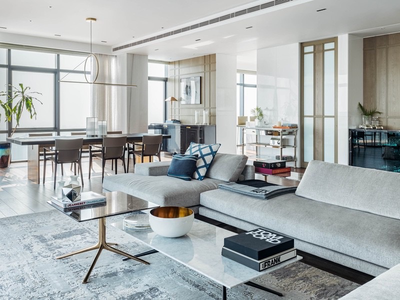
Floor-to-ceiling windows wrap around this apartment soaring above an upscale South Mumbai neighbourhood. Much of the home is a canvas in itself — one that frames many of Mumbai’s historic hotspots like the coastline and Mahalaxmi racecourse. By day, stunning panoramas take care of the odd hankering for the outdoors. At night, when the city lights are aglow, the setting is beguilingly magical. What does a designer do when tasked with the design of a sprawling apartment that comes with spectacular city views such as these? How does one maintain that exquisite balance of accentuating vantage points of the cityscape without diluting the essence of the interiors?
When Mumbai-based architect and designer Jason Wadhwani was presented with this challenge, he used restraint to transform the bare-shell interiors of a 4,200-sq-ft apartment into an upscale home fit for an aesthete to cocoon himself in. Designed to pivot around sweeping city views, this slick abode doesn’t carry unnecessary embellishments. Instead, Wadhwani drew from a minimal, modern and largely neutral palette for maximum effect.
His client, a bachelor who plays polo, and travels and entertains aplenty, came with a simple set of requirements — having lived in New York for much of his life, he envisioned an apartment that exudes the airiness of a New York loft, complete with solid wood floors. Shunning overly bright colours and loud graphics, the designer handpicked statement pieces of furniture and lighting fixtures sourced from a roster of luxury design houses. Far from ostentatious, every piece speaks volumes and quite literally makes the spaces in which they’re set in.
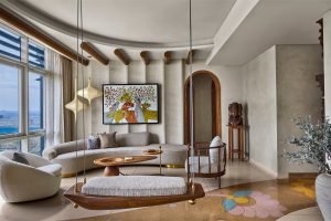
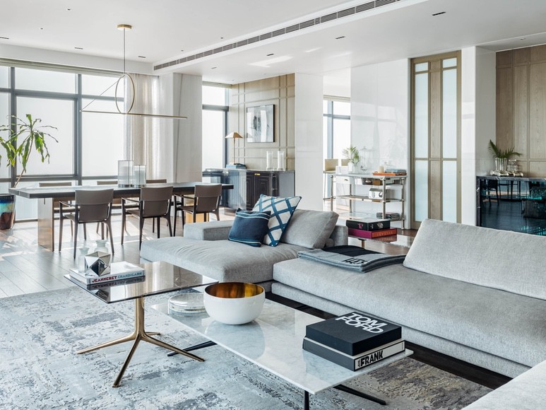
The living room and dining area occupy a single expanse. It’s the perfect place to entertain. Just a few steps away from the generously sized couch is a handsome Restoration Hardware six-seater dining table with an open-grain oak wood top resting upon a sleek brass base. A geometric metal chandelier by CVL Luminaires — a nod to the understated drama of the architectural world — sets a decidedly minimalist tone for the rest of the apartment.
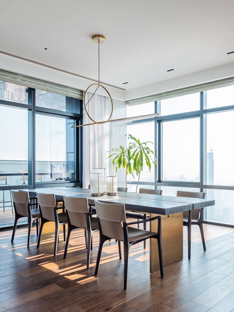
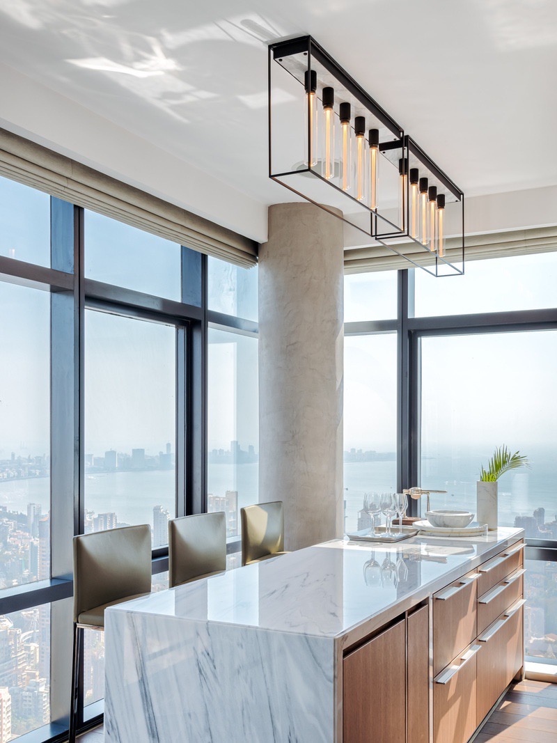
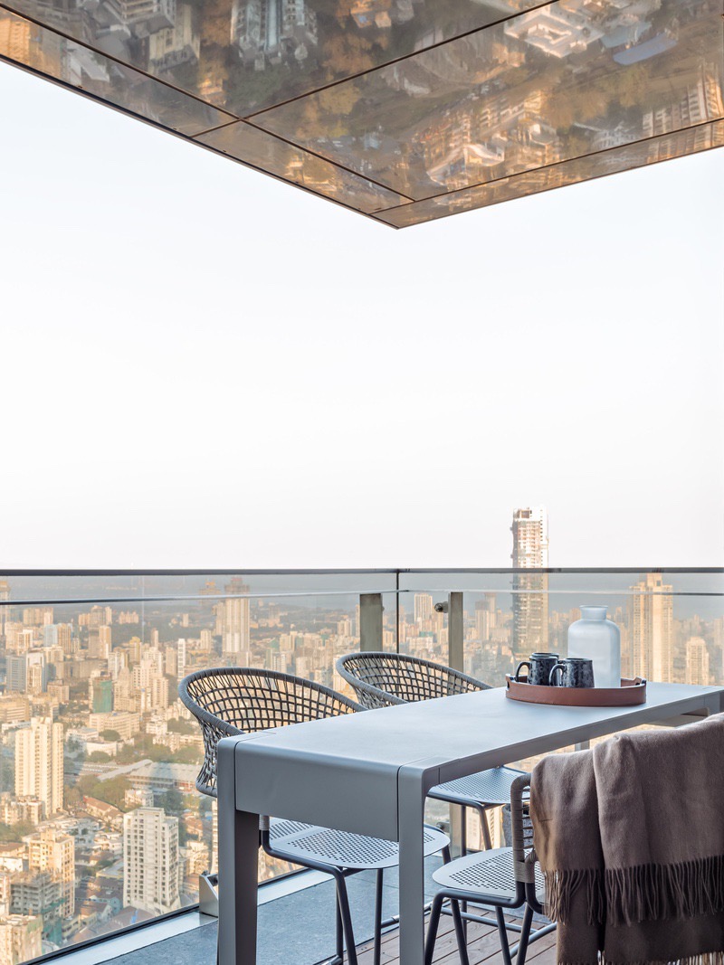
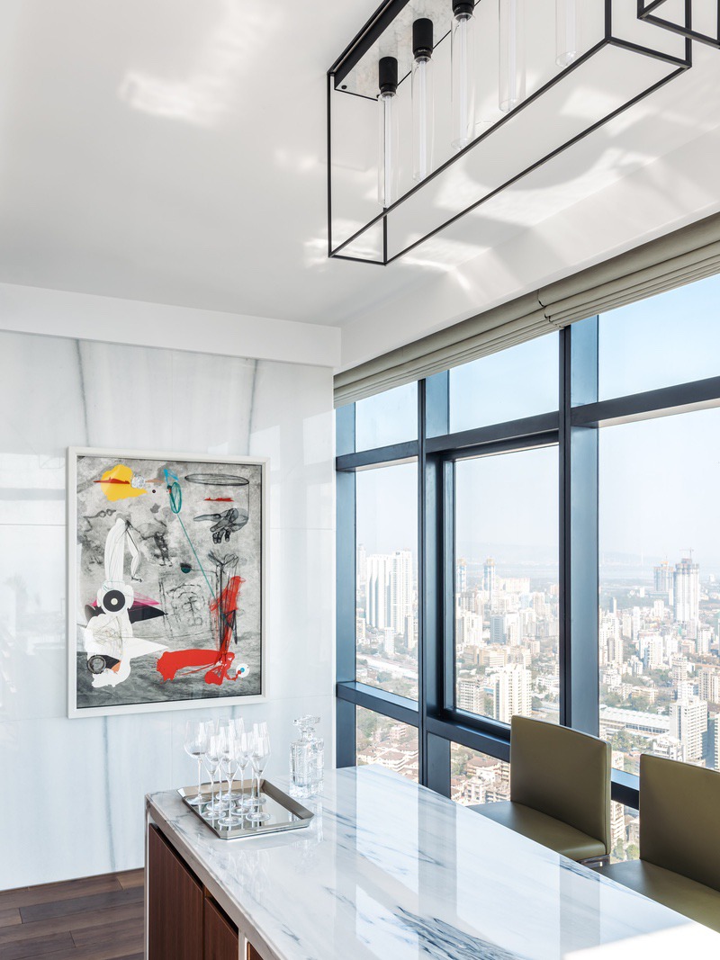
Within sight are a couple of breakout areas, apt for both intimate gatherings and sizeable soirées. The dining area opens out onto one of two outdoor decks. And, when the evening breeze drifts by, it turns into an out-and-out serene space to relax with a glass of wine in hand. Back inside, there’s the bar area dominated by a simple white marble counter from the Quarry and a singularly cool Buster + Punch lamp dangling above. Bringing in a sole pop of colour that cuts through the pared-back palette of wood and white marble is a piece of art by Indian contemporary artist Aditya Pande.
“I had to create a space which was very conducive to entertaining. So, all the public places of the apartment needed to have a feeling of comfort and warmth. At the same time, they had to have a very sleek designer feel. There had to be quite a bit of circulation space as well to move around without feeling too congested. I think we achieved this quite successfully,” says Wadhwani.
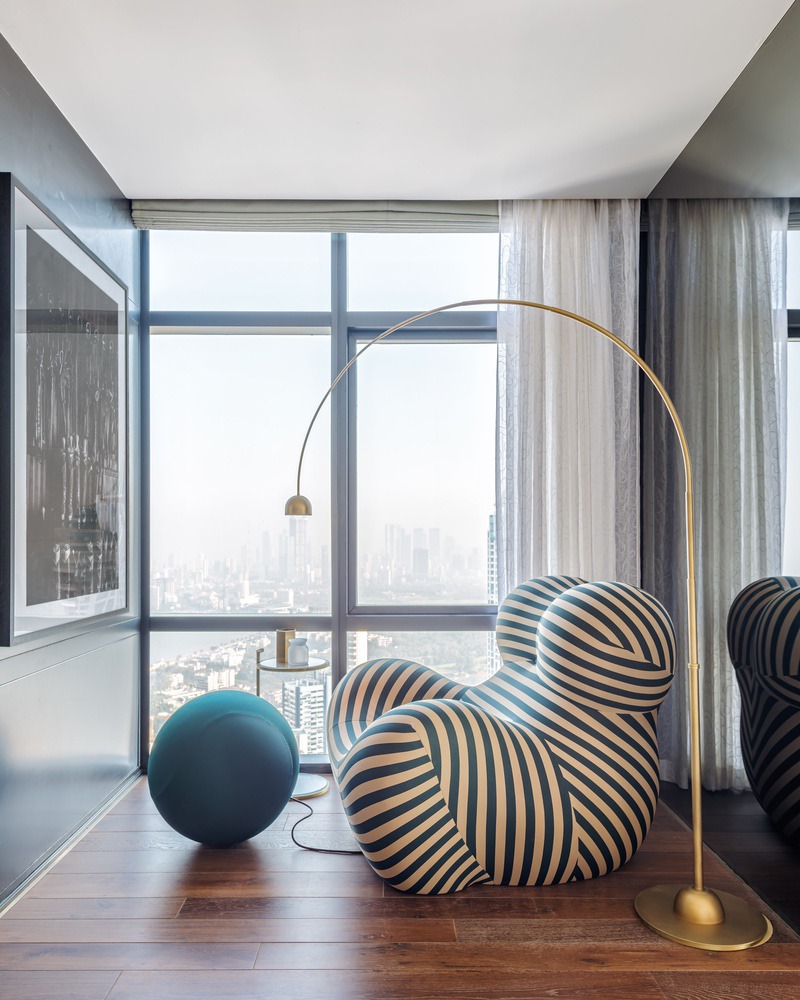
The apartment’s occupant is a globetrotter, so time spent at home doesn’t come easy. But when it does, there’s much to keep him occupied. Fantastically oversized coffee table books on such subjects as Arabian horses, art and luxury fashion houses wait to be devoured. A B&B Italia foam chair from the iconic Up series finds a fitting home in a nook in the living room — a space quite literally designed for soaking in those moments of solitude. This quiet corner is also home to a large black-and-white framed photograph of a tack room — one of the many eloquent allusions to the client’s passion for polo.
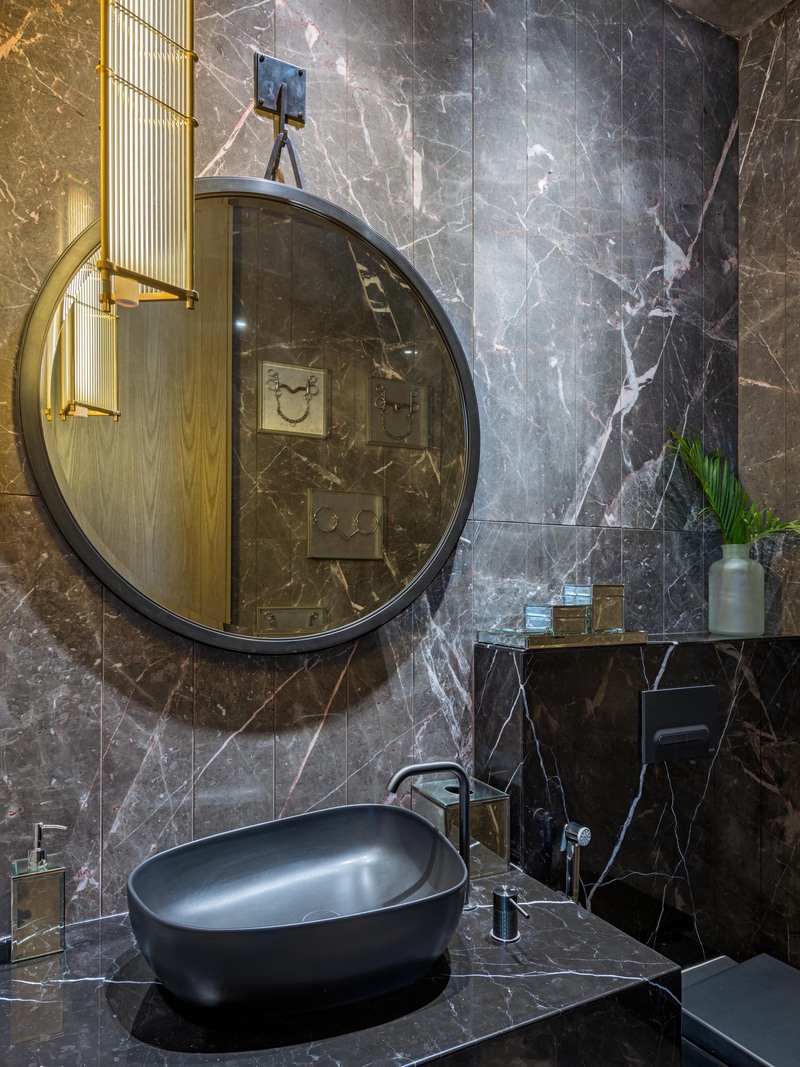
Wadhwani took the experimental route for the powder room at the living room’s periphery. Here, a second equestrian reference comes by way of actual horse bits and gags fashioned into an unexpectedly cool art installation. “As he’s a bachelor, we could get rid of a lot of restrictions and be more creative and free whilst designing the space,” explains Wadhwani, who plunged into the world of horses and polo for this project.
The powder room divides social spaces from private areas like the lounge, master bedroom and two guest bedrooms. A pared-back colour palette coupled with rich materials like wood, marble and plush fabrics flow into these spaces too. “We took up planning the layout of the entire space as one entity just so that the design aesthetic flows more cohesively,” he says.
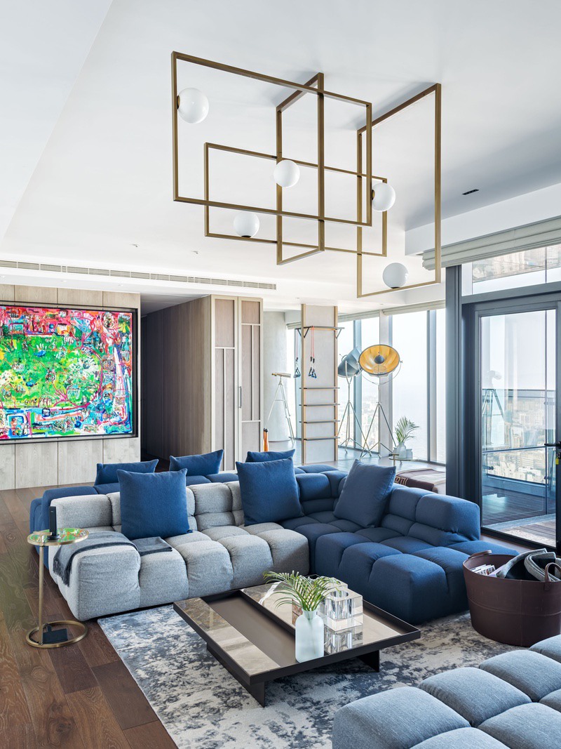
A classic B&B Italia Tufty-Time couch, originally designed by Patricia Urquiola, occupies much of the casual lounge. Wadhwani tapped into this sofa system’s boundless versatility to give his client a space for endless lounge time. “We’ve also tried to create a very warm Ralph Lauren aesthetic in the form of leather baskets placed by the sofas with a lot of throws and coffee table books to create that feeling of sinking in and being comfortable,” he says. Amid the monotone blues and greys that define this area, though, a massive piece of polo-inspired art by British artist Sacha Jafri adds the odd flourish.
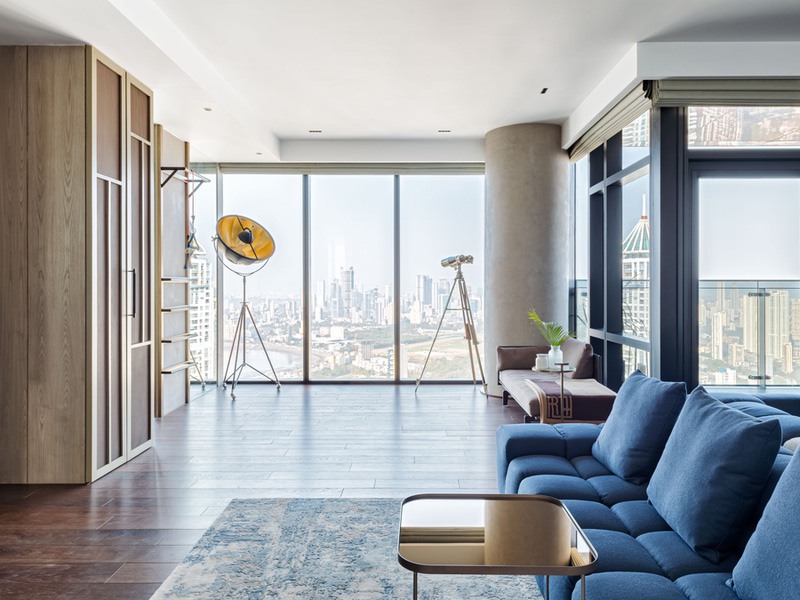
The only initial point of disagreement, says Wadhwani, was the inclusion of a workout area in this lounge. “So my client and I designed a space which was more multifunctional and organic as opposed to a proper gym. We created a full storage unit that hid his punching bag and boxing gloves, etc. so it wasn’t really in your face.”
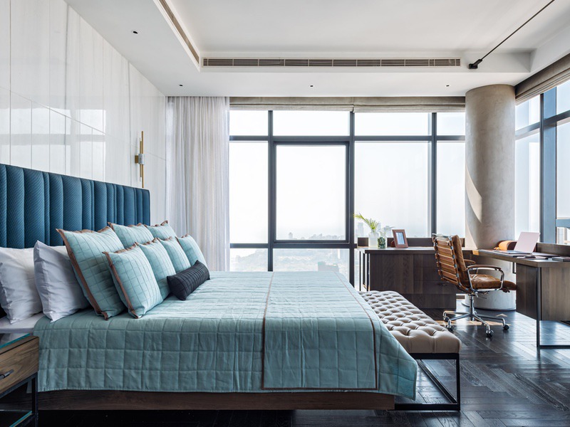
Every one of the three bedrooms come with impressive views and this led Wadhwani to steer clear of introducing any design elements that were superfluous. In the master bedroom, for example, the bed with its headboard in a sumptuous blue fabric (Atmosphere) is set against a long wall treated with white marble panelled with grooves. A dark oak wood flooring with a herringbone pattern adds a modern yet timeless touch and serves to break the monotony of the solid wood flooring used in social spaces.
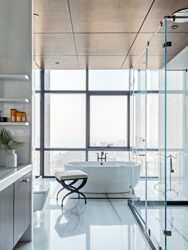
The master bathroom is expansive and relies on a monochrome-heavy palette. A bathtub overlooks the city, while the shower area re-introduces Wadhwani’s trademark monochrome stripes. And, just beyond a door lies what might possibly be one of the most coveted walk-in wardrobes we’ve seen in a while.
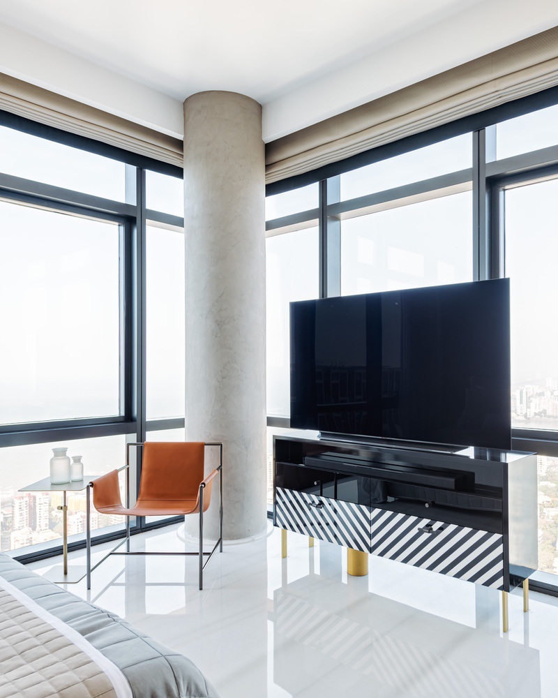
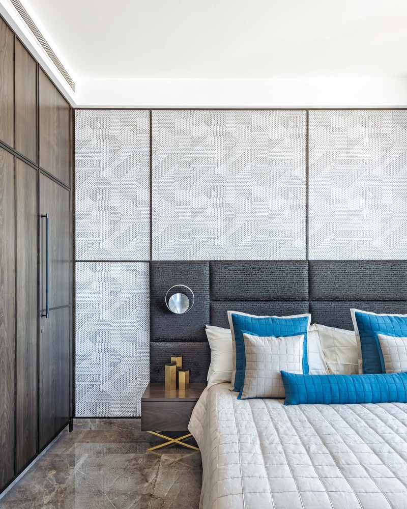
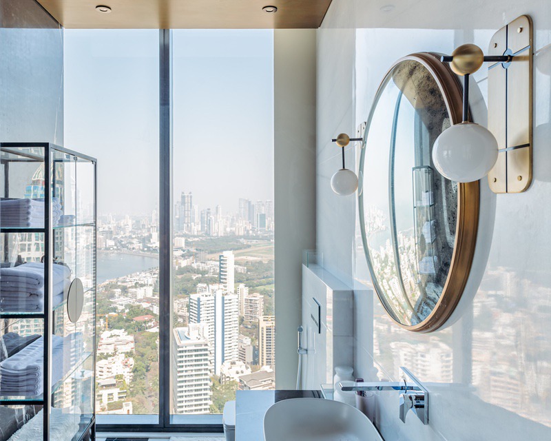
Dapper touches reign in a manner most minimal in the guest bedrooms too. In one of them, a bed back wall with a geometric wallpaper is a subtle standout amid the reductive beiges and greys. A lone Poltrona Frau ‘Ming’s Heart’ chair brings a corner of the room to life. Finally, to give this space an edge, Wadhwani brought in his signature black-and-white stripes in the form of a customized graphic console. This guest bedroom comes with what the designer likes to call “the loo with a view” —with its unrivalled views, that’s exactly what it is.
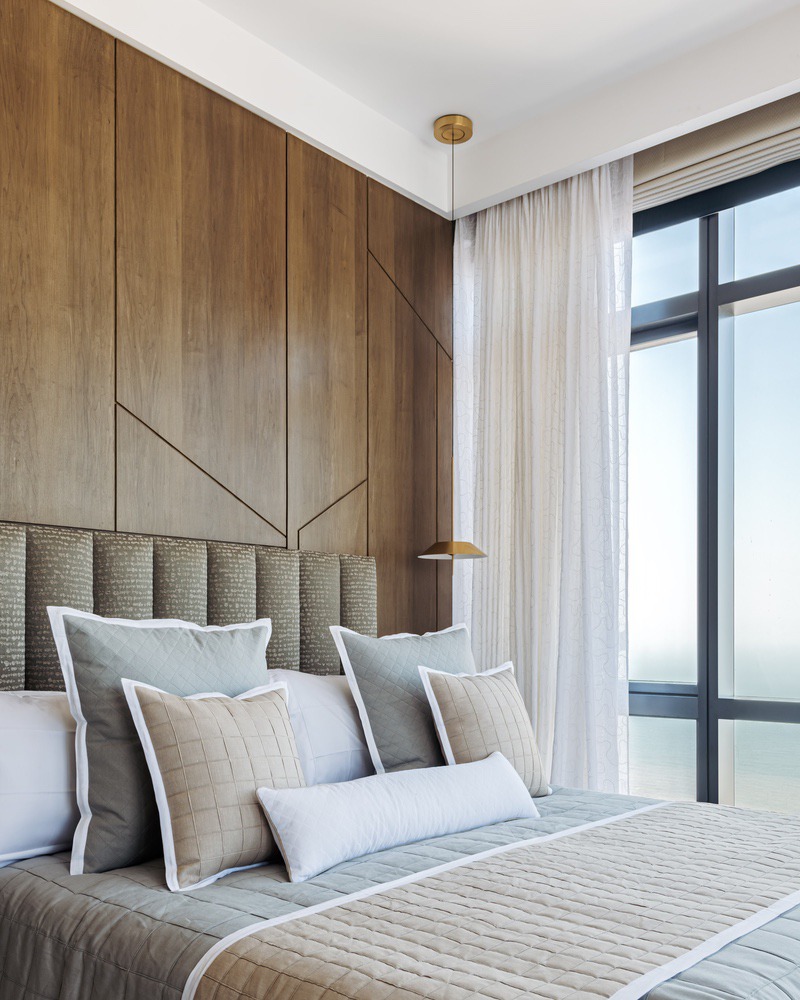
For the second guest room, he opted to go with a bed back design in neutral shades, so as to not take away from the particularly spellbinding view it commands. A pair of beautiful Dalma chairs by Baxter are placed by the window and “fit the frame of the window perfectly”.
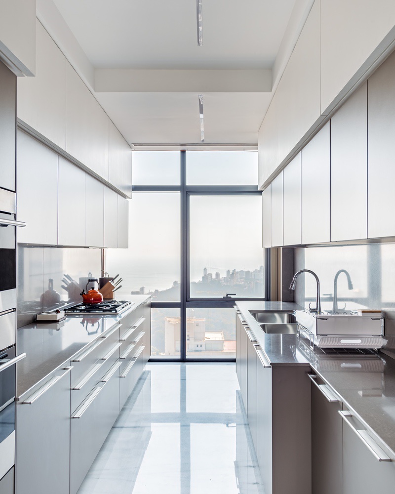
Despite the fact that the homeowner isn’t exactly one to spend hours in the kitchen, Wadhwani treated this space such that it mirrored the apartment’s overall design scheme. The kitchen has a sleek, contemporary feel with an all-around sense of simplicity and functionality. Like the rest of the apartment, it lets its form-focused interiors do all the talking.

