This Sleek 10,000 Sq Ft Home In Surat, Gujarat Aligns With The Principles Of Vastu Shastra
In the urban-most area of Surat, Gujarat lies Studio GreyBox and Neogenesis+Studi0261’s latest collaborative residential project; an apartment in a newly materialised building complex. Catering to the needs of a family of five, the space is a culmination of the best of innovative modernity and tasteful minimalism. The home is truly global in its design style, in line with the client’s worldwide approach. The homeowners, their son and daughter-in-law, and daughter boast of travels far and wide, and after having experienced unique architectural marvels and worldly cultures, were on the lookout for a home that was the best of both worlds – rooted and contemporary. ‘Casa Alleve’ checks both boxes – it’s been designed keeping in mind the principles of Vastu Shastra and is seamlessly integrated with high-end technology. An expansive total of 10,000 sq ft allows the clients to experience unconstrained luxury.
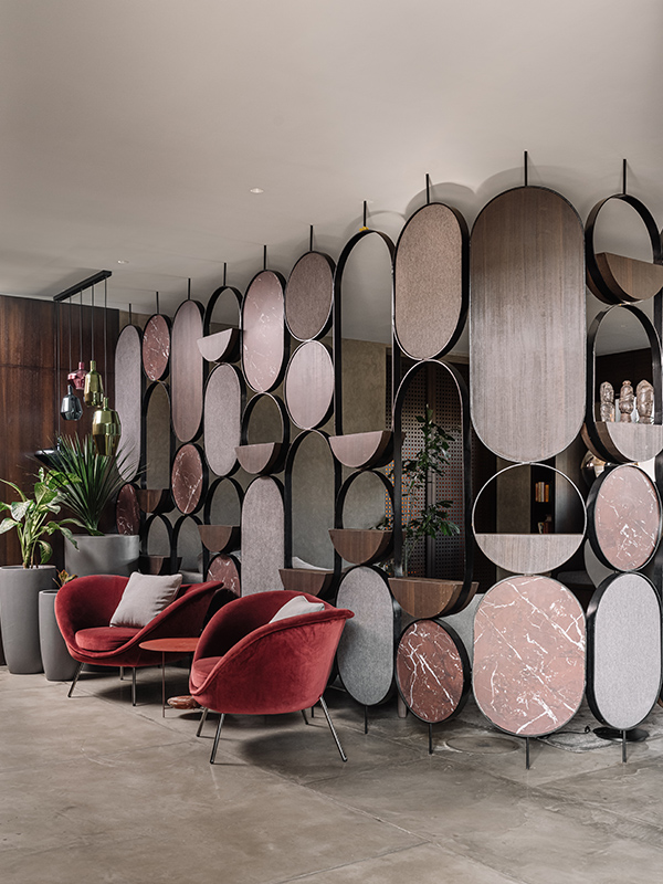
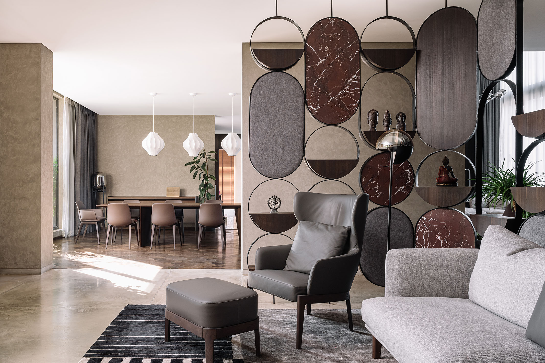
Right upon entering, it’s clear that the home is transitional and is divided into distinct areas, that each fulfils a criterion. For example, at the entrance, a foyer precedes the family seating, dining, and kitchen. A custom-made screen separates the spaces. It’s been crafted on-site in sturdy metal and is embedded with marble, wood, and stone. Not only does it act as a divider, but also doubles as a shelf to display artefacts and more. Beside it, the wine-toned seating set is a family favourite. The designers tell us that during their “furniture selection visit, the client fell in love with the Gio Ponti designed, maroon velvet-textured armchairs from Molteni.” Flanked by large planters in grey, the jewel-toned chairs stand out against the neutrals. Throughout the home, the designers aimed at crafting spaces that allowed for a cohesive “oneness” and achieved this via the use of similarly toned selections. “Shades of tans, creams, greys and greens” sit skill fully with materials like “wood, stone, exposed concrete, and marble”, says the team.
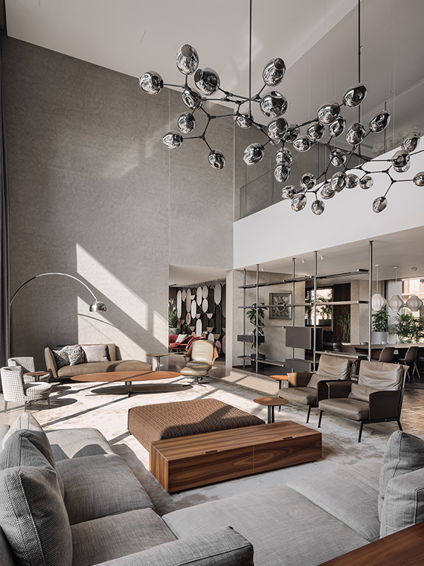
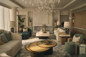
Overlooking the cityscape and brimming with natural light, the living area is the first grand space that catches the eye, and it’s the 26 feet ceiling that’s the highlight! The designers intended for this open, airy space to be used for family rendezvous. Inviting and warm, the living area is equipped with pieces from Jaipur Rugs. Hues of greys and browns are aplenty in the family living. Statement lighting in silver sets a modern tone, with a single curved lamp in the far corner of the space and a big and bulbous elevated chandelier being the two main sources of illumination. Tasteful geometry comes into play too, with auburn wooden tables in shapely styles complementing the predominantly neutral seating set. The designers let us in on a lesser-known detail about the long and intricate selection process. They tell us that the perfectly paired furniture sets and accents were decided upon after “26 months from the day of appointment, including two lockdown periods.” Eucalyptus wood finished walls encase the “nucleus” of the home while a bespoke wooden rack draws the line between the living and the dining and kitchen.
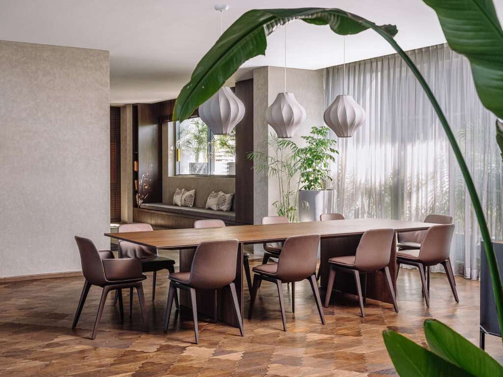
Set on beautiful brown wooden flooring from Luxurito Surfaces, the 10-seater dining table lies behind a custom-made wooden rack. Concrete texture walls bring to the space a certain austerity that’s lightened by the rays of sunshine that seep in through translucent white curtains. Three lantern-like fixtures have been suspended from the ceiling. Since the dining table is more minimal, it’s the lighting option that does the talking. Purchased from iGuzzini, the sculptural white pieces elevate the area and contribute to the home’s modernist theme. In the dining area – and the rest of the house, too – the likes of fishtail palms, snake plants, and traveller’s palms provide doses of lush green and help freshen up the home’s aesthetic. The presence of plants creates a contrast since the other interior elements are all ultra-industrial.
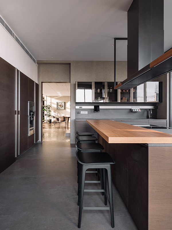
The kitchen is a culmination of a forward-thinking design style and modern-day iterations of trusted silhouettes. The traditional open plan design gets a needed update, with this particular cooking area being supremely transitional. The kitchen plays host to a huge island platform, overlooking the living and dining area. Not only does this magnificent view create a sense of inclusion and harmony, but it also aids day-to-day processes, with the task of preparing meals becoming less mechanical and more enjoyable. Kitchen equipment from the tested Gaggenau allows maximum modernity and sleekness. Sharp, linear elements and corners aplenty amp up the cutting-edge quotient. Neutral and subdued hues of creams and greys make their way into the space in the form of concrete texture walls from Colour Coats and IPS flooring from Creative Floors. While the tones of the dining, living, and kitchen are all minorly different from each other, the three spaces transition seamlessly, thanks to masterfully chosen furniture and accents.
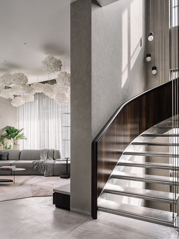
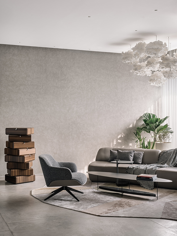
In this project, the concept of verticality is treated as fluid and spatial boundaries have been experimented with, relentlessly. Spanning over a total of three floors, this large “triplex” aims at exploring the “vertical relationship amongst spaces”. A rather industrial-looking semi-circular stainless-steel staircase helps actualize this. Its veneer-clad railing and floating cantilevered treads are supported by durable steel cables. A notch above your regular staircase, this one goes far and beyond and actually encases a glass elevator within it. An exclusive detail, the elevator provides ease of living and maximum leisure. Upon opening on the first floor, the staircase leads into the second central living area. The clients frequently stressed on the importance of additions that allowed them to “disconnect from their daily routine and give them a sense of refreshment.” Ron Gilad’s ‘Teorama’ for Molteni packs the space with a punch of style while a cloud-shaped ceiling light adds an ephemeral touch. It’s these very unique accents that make the home truly international and amp up its modernity. On either side of the central station lie each of the siblings’ suites.
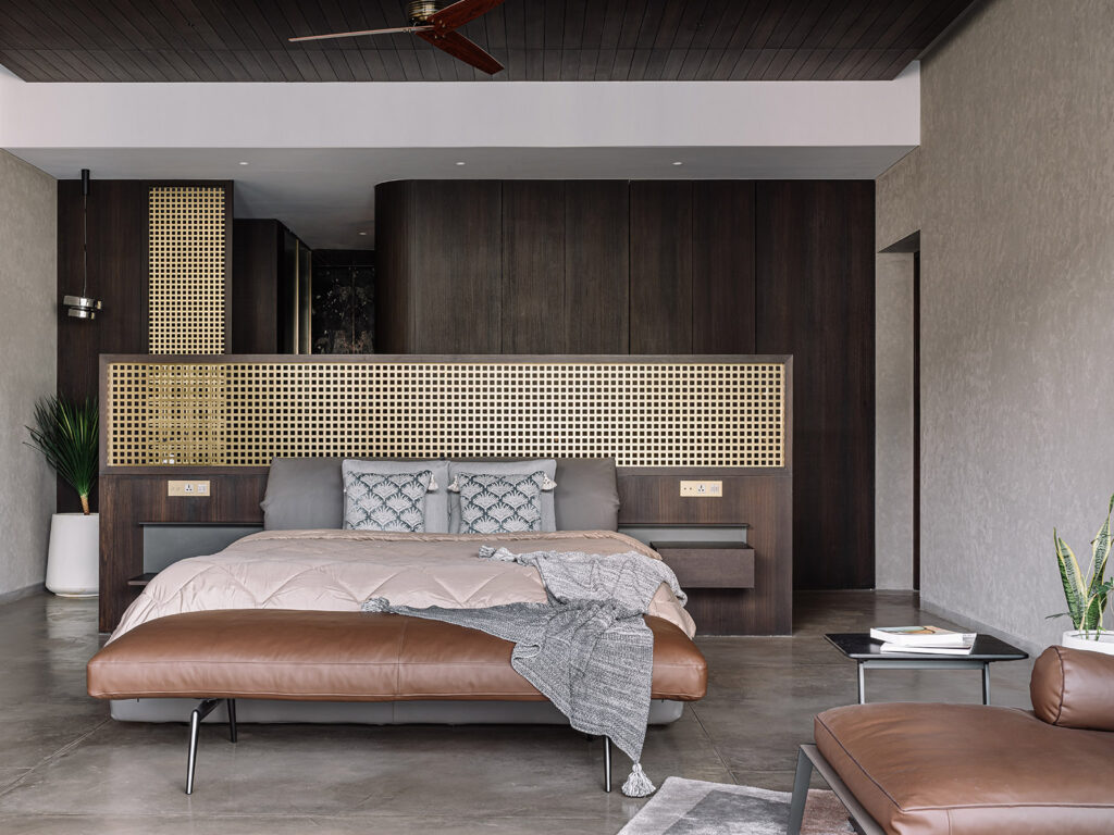
An extension of his personality, the son’s room has been crafted in muted tones of browns, greys, and tans. Dark shades of chestnut for the wardrobes add to the room’s broody theme while a bench and seating option in a lighter rust diffuse some of the seriousness. The room’s IPS flooring helps tie together all the various elements in the room, and the subtle but regal brass accents are the perfect finishing touch. In particular, the use of a single partition helps divide the room and provides privacy, limiting the view of the bed upon entrance. A single decorative lamp hangs from the ceiling, while all other sources of illumination in the room are wall-mounted. Perhaps the most enchanting feature of the room is the balcony the bed overlooks. It’s full of foliage that’s fresh and offers a space for rest and relaxation.
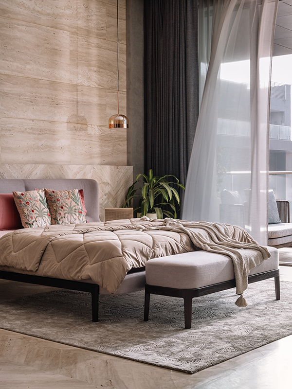
On the other side of the shared central seating space lies the daughters room. With a colour scheme that contrasts the rest of the home’s, this room features rose gold accents and goes to serve as an example of minimal luxury done right. A large queen-sized bed rests on a selection from Jaipur Rugs. Decorative cushions and throws grace the bed and the bench that sits in front of it, making the room cosy and warm. Beige travertine flooring acts as a welcome change from the rest of the floors and pairs well with a similarly shaded wall. Like in the son’s room, a simple decorative lamp is suspended from the ceiling – this time in a regal rose gold. It’s the delicate details like this one that unite the various spaces in the home. Ceiling to floor sliding doors offer a view of the balcony that awaits, allowing plenty of natural light to flood in.
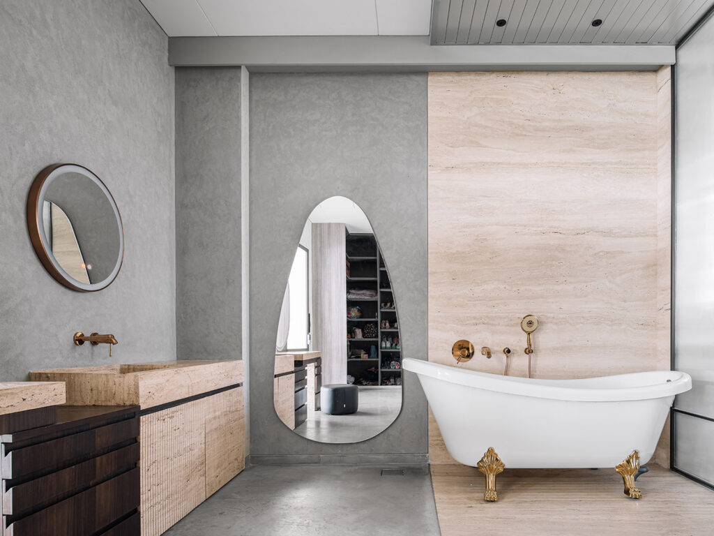
What truly makes this room the daughter’s is the realisation of her vision: that of an ultra-luxe bathroom, complete with a functional walk-in wardrobe and extravagant bathtub. The space is a manifestation of fanciness and features new-age regality at its best. The use of rose gold extends here too, albeit this time with tones of stark white. A failsafe combination, the two hues sit together seamlessly. Yet another noteworthy accent materialises itself in the form of shapely mirrors – oblong and circular. With its unique colour scheme and toned-down approach to luxury, the bathroom is high on fashion and on functionality.
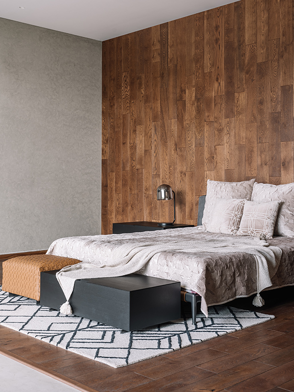
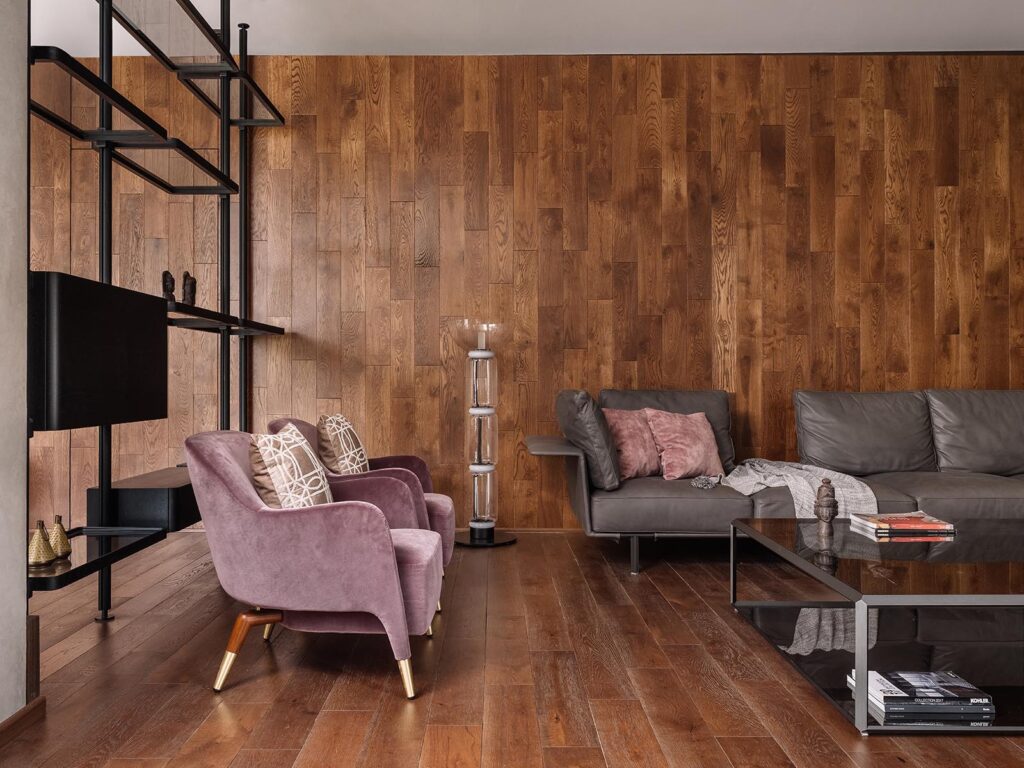
The finest manifestation of luxury, the master bedroom encompasses a seating area, king-size bed, reading nook, and more. A set of shelves in a screen-like format separate the populated seating from the large bed. Ideal to hold memorabilia, this screen separates the two areas and helps create two distinct spaces within the room. Couches covered in royal velvet surround a low-lying coffee table, creating an area that’s perfect for tea and conversations. Renowned names like Flexform and Molteni have contributed to the seating options in the room. In a far, secluded corner, lies the reading nook, designed to encourage the inhabitants’ most loved hobby. The room’s clad in wooden veneer from Kaashtha and flooring to match from Luxuritto Surfaces. The streaked hues of brown offset the tones of grey and tan. A similar colour palette can be found in the equally grand bathroom, too.
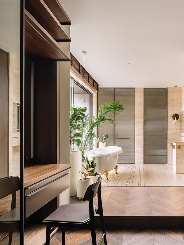
Key details like ledges and elevations help separate the walk-in wardrobe and vanity from the bathroom. Sanitary ware from TOTO and Hansgrohe make for a bathroom that’s as high on functionality as it is on fashion. Tones of beige and ochres contrast the otherwise normalised browns and greys that run throughout in the rest of the house. Large plants add a dash of green, a welcome highlight.
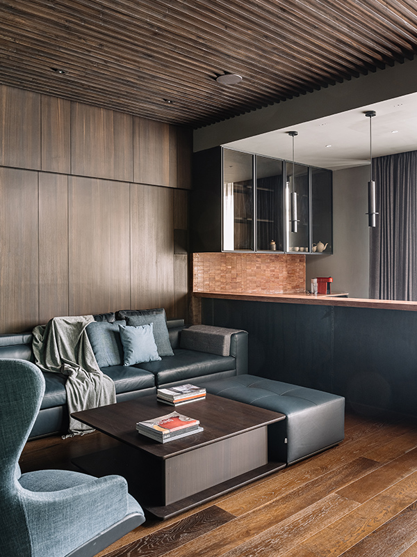
Adjacent to the master suite and distant from the rest of the home’s hustle and bustle is the home theatre that sometimes doubles as a space for work and meetings. Not only does it provide the homeowners with a space to catch up with family, it also is the perfect area to waste a lazy Sunday in! Equipped with audio and video aids from B&O and Samsung, the room combines the best of new-age technology with a classic design style. The theatre also houses a mini-pantry within it, ideal for random cravings and urges. Here, a red Agra stone platform is an accent that stands out, juxtaposing the wooden finish that’s used for the ceiling, walls, and floor. On the same level as the master suite and theatre, is the outdoor terrace garden.
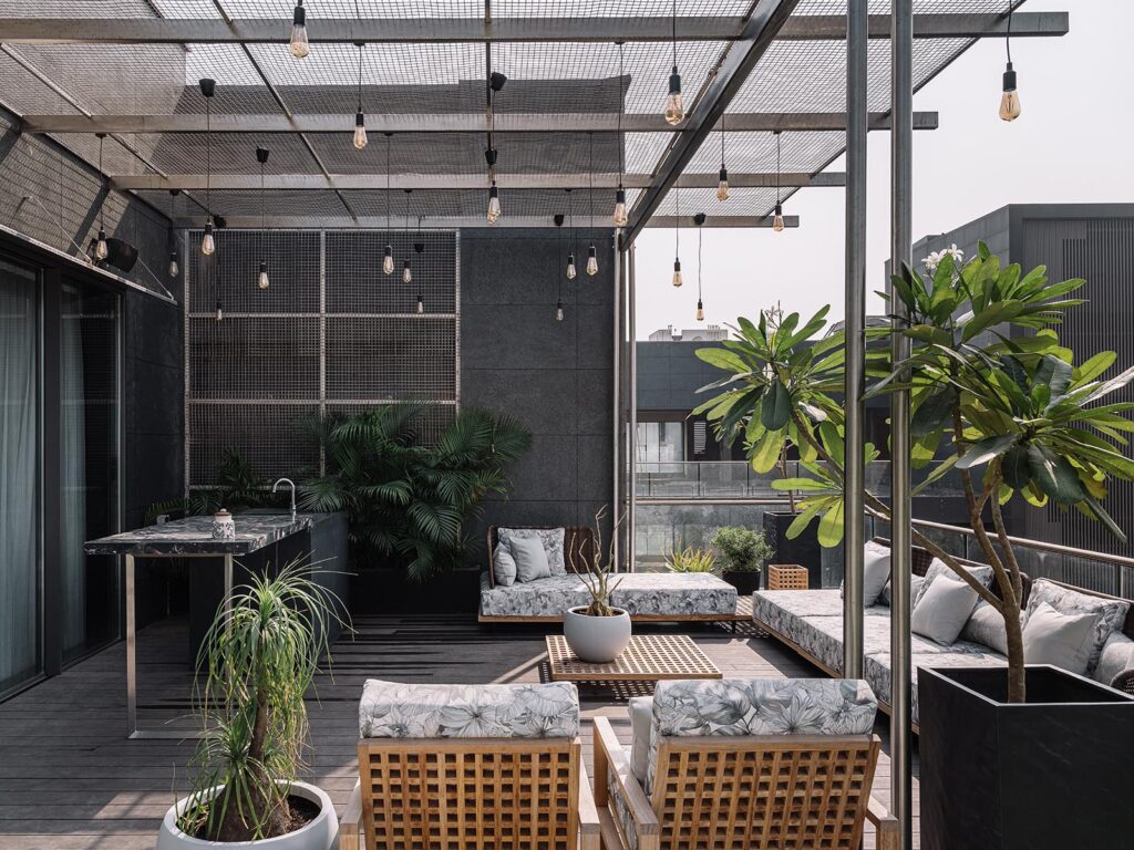
Open to sky spaces with lush greenery are hard to come by, which is why the outdoor patio is a coveted area. With aesthetic bulbs suspended at varying lengths above a charming seating area, the terrace is perfect to host friends and family. It features a bar counter and seating options that are spacious and stylish. Yet again, packed with greenery, it’s in touch with nature, more than the rest of the house. Casa Alleve combines the best of modernity and minimalism, in a unique manner and is an embodiment of the most refined styles. It’s a space that spans wide and tall and caters to needs that are both rooted and contemporary. A play of monochromatic styles, closed and opened spaces, and varying levels, it’s a manifestation of timeless newness.

