DESIGN PATAKA # 21 – Exquisite Penthouse – Rajiv Saini – Part II
- 22 Nov '12
- 3:30 am by Crew
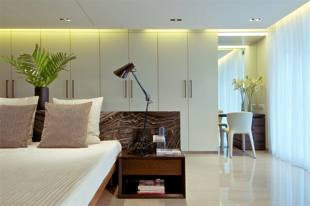
Part II showcases the balance areas of this expansive house, all the private spaces. The master bedroom has our favourite, an island bed. Bathed in white with a hint of the beautiful brownish marble seeping in. Plain white sheer curtains. The marble extends into the bathrooms. Rajiv Saini has gotten rid of the conventional large mirrors and lets the marble enjoy the glory. Using this together with a relatively simpler marble for the rest of the space.
The next Bedroom we see golden Bisazza Mosaic used in the furniture. The rest of the room is white. Here the veneer takes charge in being the pattern dominant. The white corian ledge follows all around the ledge so as to get adequate yet recessed lighting. We love the Zieta Standard Plopp Stool, looks like metal blown up. Available in a whole range of colours, Rajiv has used an inox polished one. Gold Bisazza Mosaic is also used in the powder room with the hard wood flooring. Use mirrored walls and ceiling only in areas where the steam and moisture content is low. Hence Rajiv has used mirror on the ceiling in the powder room and increased the volume of the space. We love the wood cabinet for the basin. Goes beautifully with the flooring adds a nice design element.
The next bedroom is sons room, hence Rajiv Saini tells us it has been designed with warmer tones, less marble and more wood. The interesting chair is from a Dutch designer who specializes in recycled furniture. Customised terrazzo spans the wall opposite the bed. Dark chips with little bits of mirror mixed in. A fine sliding steel mesh separates the room and the bathroom. The guest bedroom has a massive wall which could not be broken. Rajiv decided to not constrain the room and make it small, making it an open space. A low bed has been placed on the step up. The same marble on the flooring climbs the unbreakable wall making it look like one solid piece. The last bathroom has marquetry done on the wall with wood. Notice the random pieces of mirror replacing the wood. The picture can get a bit confusing because you are also seeing a reflection. The black basin makes for a good change from the usual white. The single beam of light illuminating the counter is a nice touch.
Rajiv Saini has tied the entire space together with his signature style. Homogeneity in character highlighted by stunning design elements making each space something to talk about.

