Defying Design Tradition At ‘The Pink Zebra’
- 12 Apr '18
- 10:51 am by Shireen Jamooji
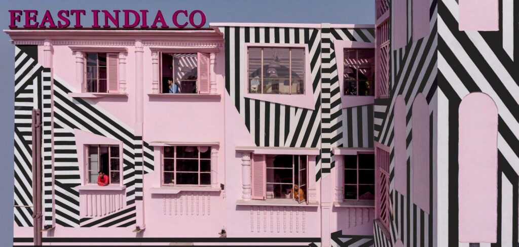
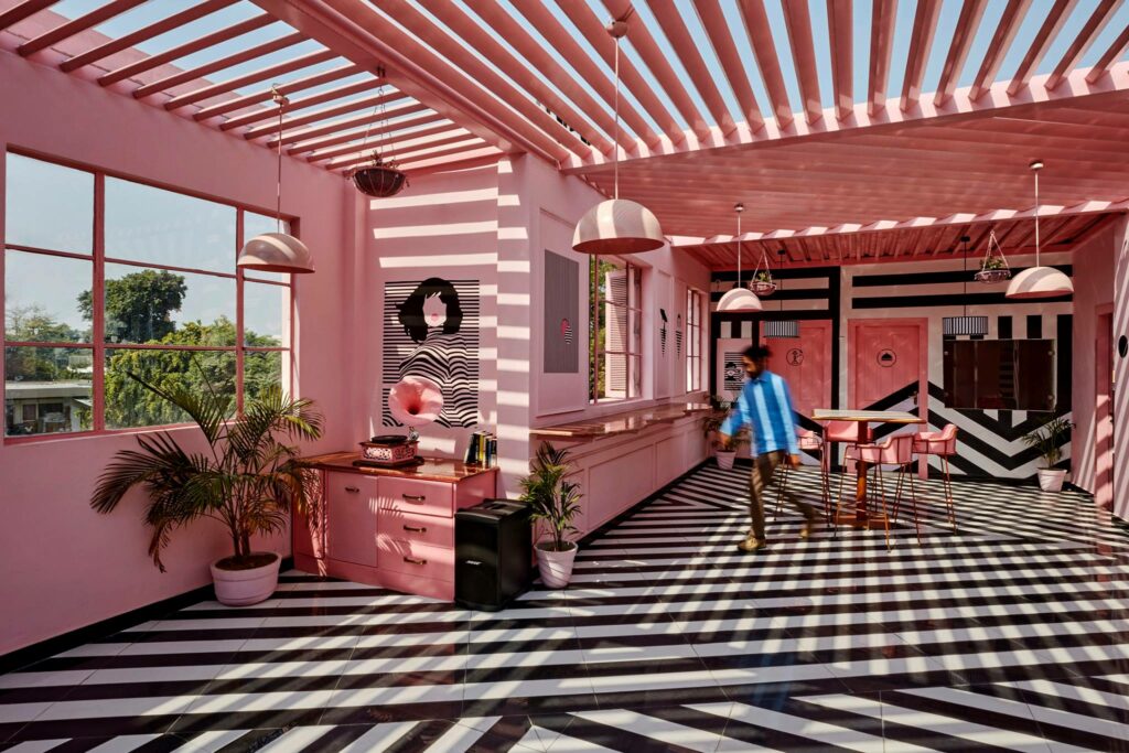
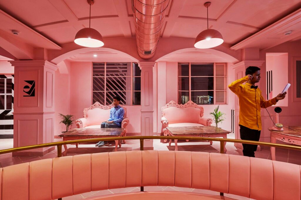
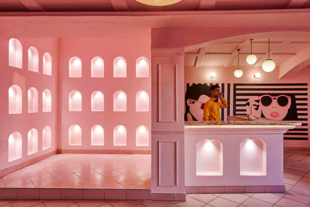
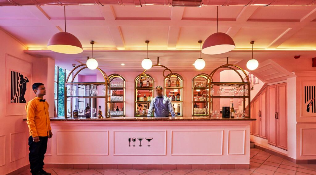
The most memorable places are often the most unusual, and though in India we’re still in the midst of a minimalist revolution there are some places that dare to break all the rules, and sometimes, it comes from places you’d never expect. One such quiet revolution has just come to fruition in Kanpur, Uttar Pradesh at ‘The Pink Zebra’ – Feast India Company. Designed by Renesa Architecture Design Interiors, this 4,000 square foot restaurant looks like something straight out of a Wes Anderson set – a favoured aesthetic for the client – that merges an old world charm with a striking modern persona.
This ties into the history of the building itself, which has been placed and restructured on a 100-year-old British Raj house which accentuates the transition of old to new, merging colonial architecture with a bold ‘Art Noveau glitz’. Head architect Sanchit Arora notes that the building’s age was one of the primary challenges that they faced during the design process, “The hiccups started with the structure itself, the walls were load bearing and couldnt have been shifted to ease out on the spaces, hence the need to play along the given restrictions was fun but again a big challenge.”
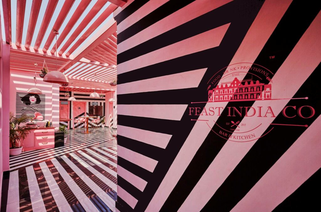
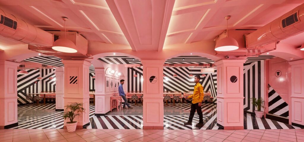
The idea to divert from tradition and offset bold ‘zebra’ stripes of black with a monotone was a huge risk on the part of Renesa Architecture, this level of contrast hasn’t been attempted anywhere in the world, but Sanchit believes that Kanpur was actually the perfect place for this experiment. “India is a growing country , and most of the growth is not typically taking place in the first tier cities but infact the second tier cities are where the major infrastructural developments are taking place” he says, “I would be actually not agree to call Kanpur as a rural Indian typology but would rather term it as a potential centre of growth in the heart of Uttar Pradesh , just placed next door to the capital city of Lucknow.”
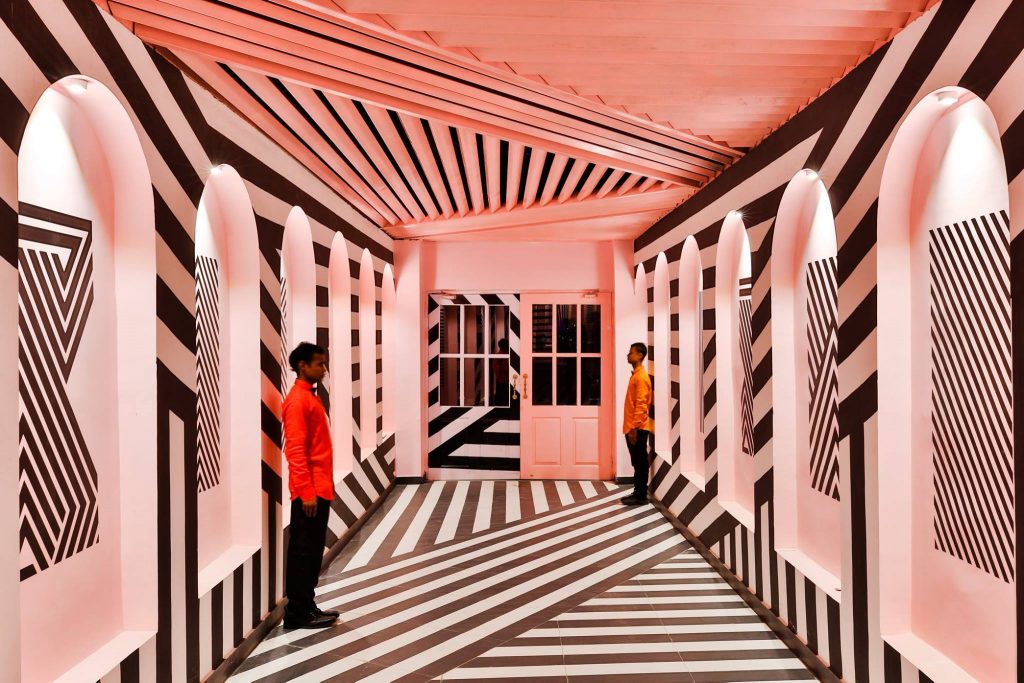
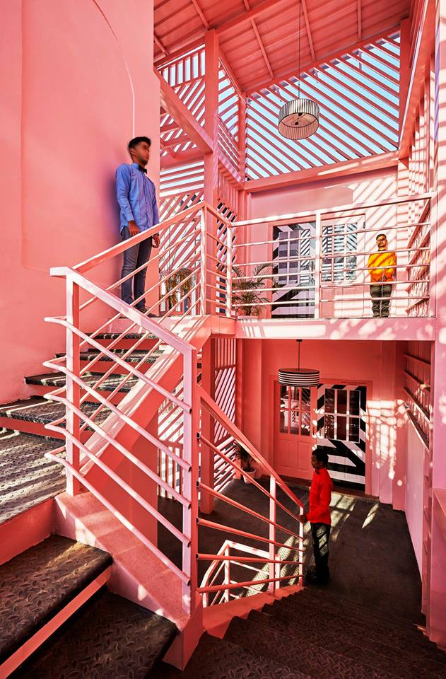
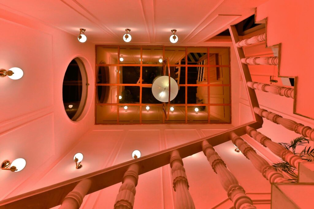
‘The Pink Zebra’ is a design ode to the contradictory architecture, where in the midst of the quirky splashes of colour lie a subtle symmetry that is surreally soothing. The aim was to stir up the Kanpur restaurant experience, creating something unforgettable which openly expressed a depth of personality and character, it has clearly achieved its goal and put this little city on the design map. This is definitely not a place you can idly pass by and though Sanchit feels like every inch of the space has a certain charm, there were some elements that he favours, “The play of light, color and the lines is a simple ideology when put on paper but in reality it has so much potential which can be clearly seen through this space. And the staircase well with the natural reflected zebra light with the intersecting line entrance foyer are my personal favorites”
This captivating project has succeeded in a space where many would fail, they’ve defied tradition, space, location and convention in order to take a chance on imagination. The striking colours in the facade cultivate a unique experience before you’ve even stepped through the doors. Nobody could ever called ‘The Pink Zebra’ monotonous and it stands as a testament to the growing courage of the Indian design community.
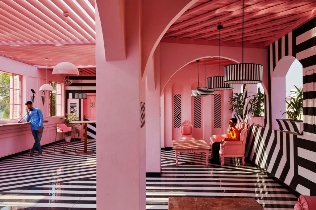
Photographs Credit – Saurabh Suryan / Lokesh Dang. // (http://suryandang.com/)

