An Overdue Review of the Bigg Boss House
- 14 Dec '13
- 8:30 am by Crew
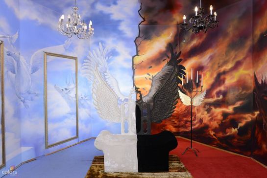
Now now, there’s a voyeur in all of us so we are really not judging if you watch Bigg Boss or not. But one particularly mind numbing episode made us suddenly realize, how the hell have we never reviewed the Bigg Boss house? We are in the business of spaces and design so we surely must have an opinion on the one house watched by millions day in and day out for 15 weeks.
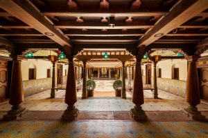
And that’s just the tip of the iceberg, for one cannot simply ignore a house that looks like a mash up of too many different eras and styles. Art Deco, Art Nouveau, Contemporary with a dash of Modern to the mix.
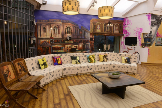
So turns out that this massive space of 10500 sq feet, is designed by Bollywood’s ace designer Omung Kumar who has aimed to bring alive the essence of heaven and hell inside the Bigg Boss house. He states, “The theme of the show is based on heaven and hell and the challenge given to me was to create two extreme conditions under the same roof. Following the brief, we created two different houses illustrating Jannat and Jahannum. We have played around with colors, patterns and have introduced quirky elements to justify heaven and hell.”
While we love Omang Kumar sets for Sanjay Leela Bhansali movies like Black and Saawariya. (We do, really.) We are not quite fans of the Bigg Boss House which looks like every piece from his wife’s store, Bioscopewalli just put in a new location.
![RTA_9614[1]--621x414](http://designpataki.com/wp-content/uploads/2013/12/RTA_96141-621x414-1.jpg)

And we do give marks for trying something different but this OTT clutter is something no one would want to see day and day out especially when you are locked up with unknown people for over a 100 days. A nice place would be a good plus, to say the very least.
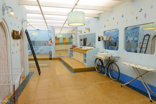
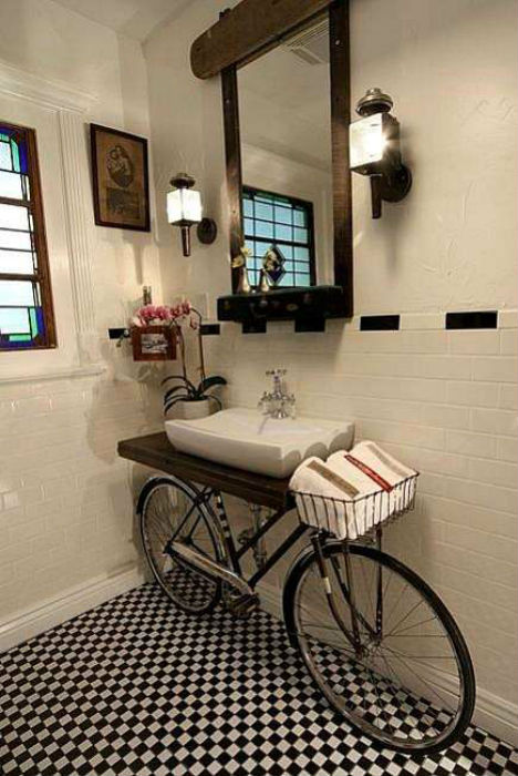
The cycle idea in the bathroom has been doing rounds on Pinterest for very long. Come on guys, now don’t copy directly off websites. Everyone’s on it these days.
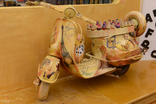
What is a scooter doing in a look like this? We still get the cycle but a scooter?!
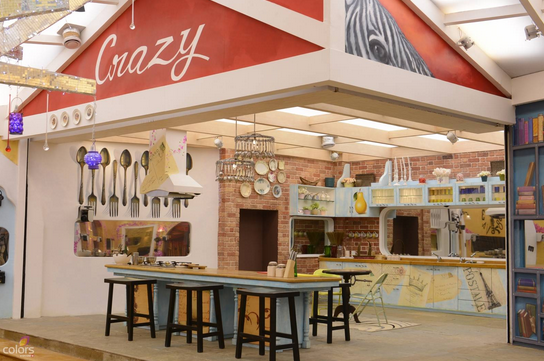
The significance of writing crazy over the kitchen? Any idea why? Wouldn’t it make more sense to go with a saying like “Something’s Cooking”?
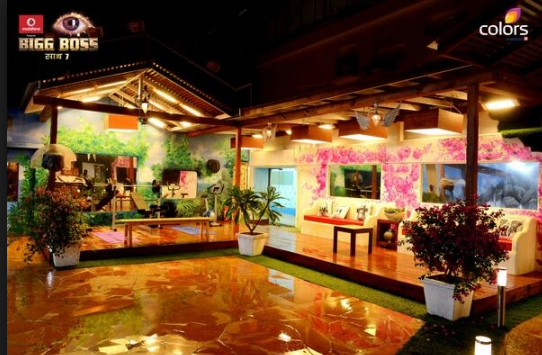
We also don’t get the patio. A delicate pretty floral wall mural spreads over the white wall and then they stick cream modern stubby sofas against it. A stark pink and white wall clashing with cream and red sofas. We think a wicker sofa with a soft pastel color make more sense; more feminine to coexist with the floral.
Also, overall we feel like one style would be a better way to go. Something a little more on the lines of Pride and Prejudice would be a good option. (two words so ironically synonymous with the show)
On that note, we are done critiquing the Bigg Boss House. Tell us what you think of it? Meanwhile, we already look forward to a new season with new inmates and a new house, both with better sensibilities 😉
Photographs via Colors, Pinterest, Koimoi, Live Mint
Omung Kumar Quote via Times of India

