The Ultimate Cheat Sheet To Effortless Pattern Play
Dive into the secrets of mixing patterns, creating a harmonious, layered design that elevates any luxury interiors.
Patterns possess the unique ability to transform spaces, bringing personality, depth and a sense of intrigue to any room. Yet, the idea of mixing patterns in design can feel like navigating a minefield. What patterns work well together? Will it be chaotic? These are common questions that often overwhelm homeowners. Each chosen pattern contributes its voice to a conversation—whether it’s bold or subtle, organic or geometric, colourful or neutral. Without further ado, let’s dive into DP’s ultimate cheat sheet that lays out interior design tips and pattern layering techniques to help you create an effortless pattern play in your living space that’s as captivating as it is cohesive.
1. Narrow Down On A Focal Pattern
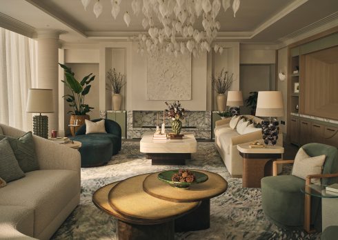
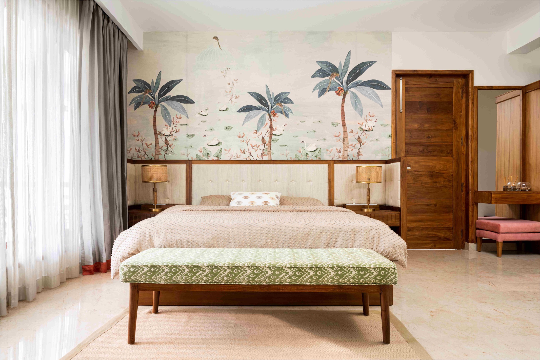
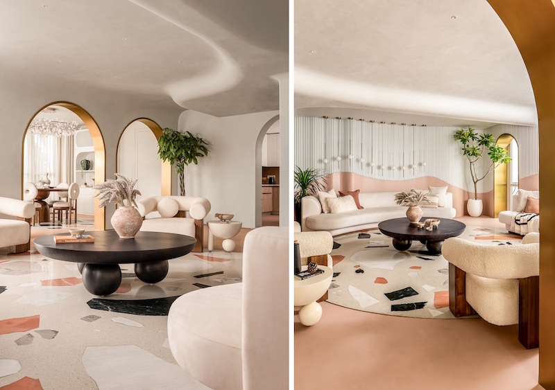
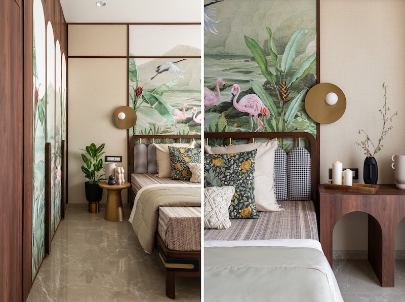
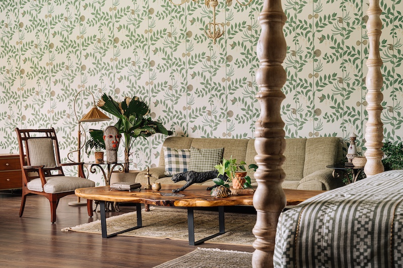
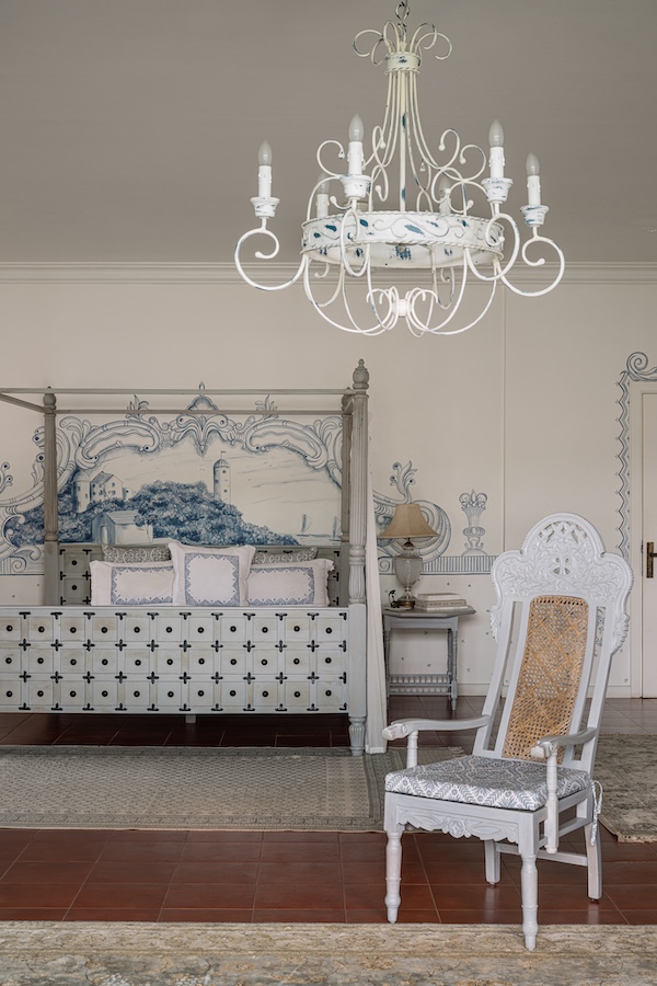
One of the top pattern trends for 2025 home décor is establishing a dominant or “anchor” pattern, which sets the tone and serves as the primary source of inspiration. It’s often the most elaborate or colourful pattern in the mix—think a large-scale floral wallpaper, a richly patterned area rug or a vibrant upholstered armchair. The choice of anchor pattern reflects the room’s energy and how it’s meant to be experienced. Perhaps a soft, botanical print creates a sense of calm in a cosy bedroom, while a bold geometric rug can infuse a living room with vivacity. This anchor pattern acts as the design’s heartbeat, influencing every element that follows.
Also read: Inside A Pune Home That Ditches Neutrals For Bold Hues
2. Envision A Coherent Colour Palette
Colour is the glue that holds different patterns together. Your anchor pattern—whether a statement tile, a wallpaper print or an upholstery fabric—often dictates a natural colour story. Consider playing with varying shades of a single hue within the pattern or letting the colours subtly echo across secondary elements. This continuity helps stabilize your home interior design, allowing disparate designs to coexist without clashing. Moreover, innovating with finishes—matte versus gloss, textured versus smooth—can further enrich the interplay of colours.
3. Keep It Fresh With Varying Scales
One of the cardinal rules of mixing patterns in design is to vary their scale for visual intrigue – no one likes an eyesore. For instance, an oversized floral on upholstery can be juxtaposed next to a finely detailed geometric pattern on cushions, while a mid-sized motif on a rug bridges the two. Large-scale patterns make a statement, while medium or small-scale prints act as supporting players. This contrast in scale simulates a hierarchy where each element amplifies the overall design. Scale variation can also imbue dimensionality and give the space an intentional look.
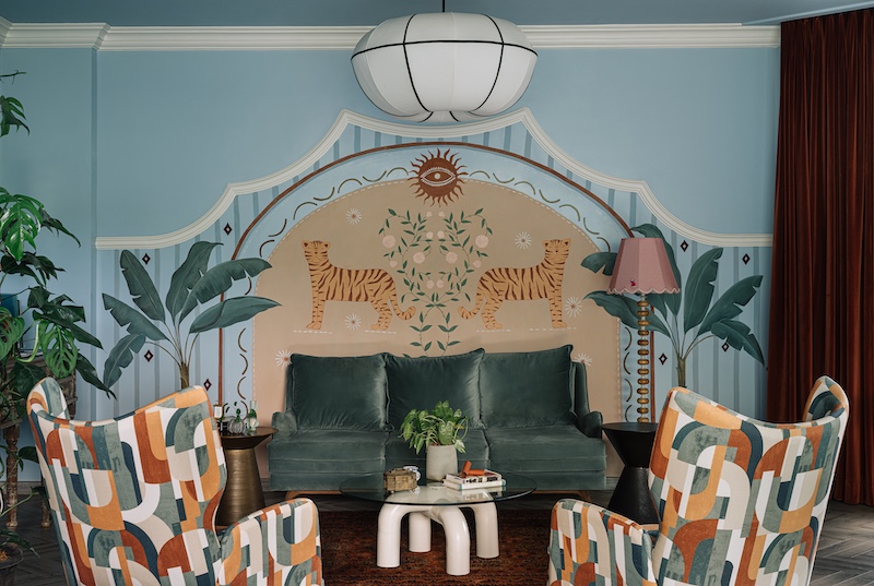
4. Play With Motifs, Create Contrast
While cohesion is key, a little contrast never hurts. Combining different designer pattern combinations—such as organic patterns (florals, botanicals) with structured ones (stripes, plaids, geometrics)—creates a dynamic interplay that feels curated and thoughtful rather than forced and uniform. The contrast between flowing, natural forms and rigid, linear designs allows each pattern to stand out. Experimenting with print styles—vintage damasks paired with abstract designs—can create a visual rhythm.
Also read: #DPExclusive: This Sun-Drenched Mumbai Apartment Is An Ode To Layering And Japanese Minimalism
5. A Dichotomy Of Bold Vs Neutrals
Patterns bring energy to a room, but too much boldness can overwhelm the senses. The key is to offset dramatic layers with subtle patterns in interiors. A neutral backdrop can prevent the space from feeling too busy, thereby allowing the eye to naturally gravitate towards more dynamic wallpapers or murals. Soft, nature-inspired motifs evoke a sense of tranquillity, while geometric designs introduce energy and structure. When paired thoughtfully, they balance each other out—imagine the opulence of an ikat pattern playing against the simplicity of fine pinstripes.
Ultimately, matching patterns for interiors isn’t about rigid rules but about creating an authentic and inviting sensory experience. To refine this approach, consider the emotional tone of the patterns. This layering technique ensures that your interiors emerge as a true reflection of your narrative. These interior design pattern tips remind us to embrace the unexpected joy in layering that makes a home uniquely yours.