3 New Stores Elevating The Retail Experience Through Spatial Storytelling
With a retail experience as bold as their product and brand identity, these newly designed stores in India steer clear of convention.
Redefining customer engagement is non-negotiable in an age where e-commerce is the preferred platform for a hassle-free and choice-laden retail experience. It’s why we’re seeing the resurgence of brick-and-mortar stores in the retail landscape. There is, after all, no better place than a flagship, or even a pop-up, to catch a new customer’s fancy and immerse the loyal patron in an unsaturated brand experience. Spatial storytelling in the retail environment can pique curiosity about the product, evoke emotion, and build a sense of loyalty going beyond the transaction. Retail design now goes above and beyond adhering to a brand’s colour palette—it extends to a carefully crafted visual narrative that weaves in custom displays, impactful materials, adaptive store designs, nooks that intrigue, and so much more than just a conventional retail experience.
In this curation of new retail spaces in India, we highlight the impact that understated edginess and restraint can bring to the fore. From a couture store with a brutalist-inspired shell and a light showroom bathed in minimalist and modern touches, right up to a craft-inspired womenswear store that has cleverly revitalised old elements to underscore its passion for craft revival, here are some fine examples of brands that are transforming the in-store shopping experience.
#1 A Study In Modern Monotone, Prism Lights By Studio Ruh
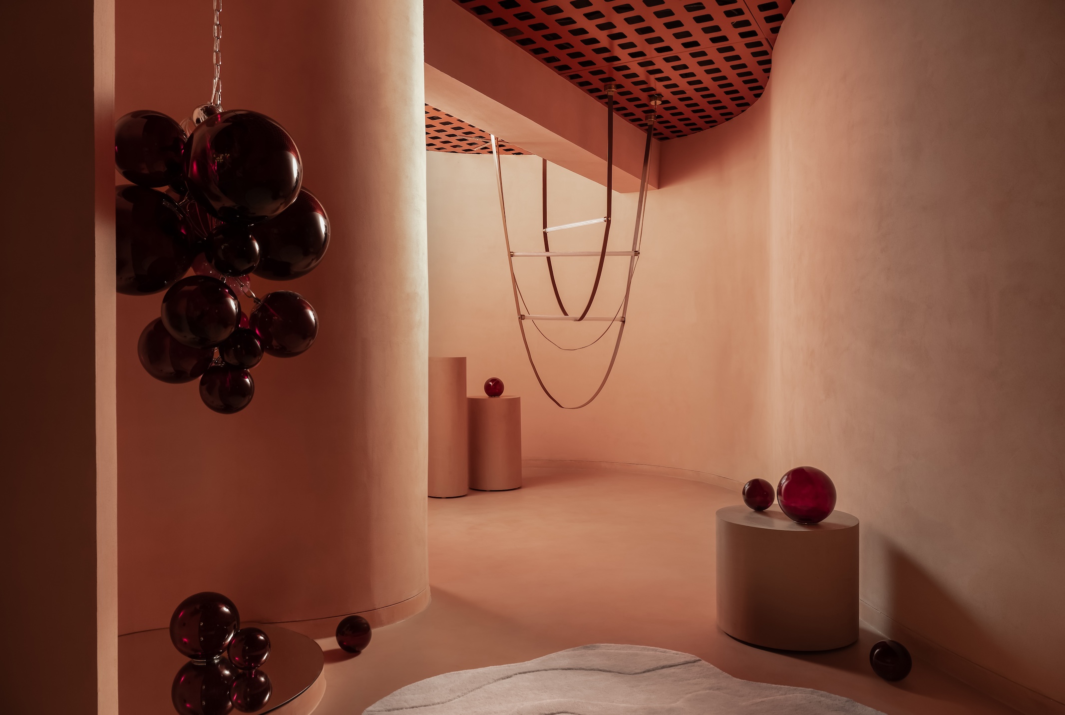
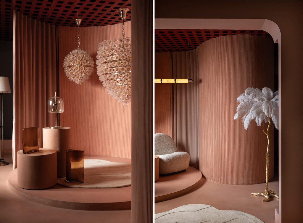
Upon arrival at the Prism Lights store in Bangalore, lighting fixtures in all shapes and sizes guide you home as you get that much closer to selecting the lighting of your choice in an unrushed manner. In the industry for two decades, Prism Lights is the go-to lighting solutions provider for architectural, outdoor and decorative lighting in the South Indian city. The new 1,500-sq-ft space, housed in a 20-year-old building, showcases the brand’s lighting solutions experientially. Materialised by Studio Ruh with principal designers Shruthy Sanghvi and Kavya Sheth at the helm, the store offers a modern “monotone and restorative” backdrop for the lights on display.
Also read: The New Faces Of Mosaic: 3 Indian Artists To Follow
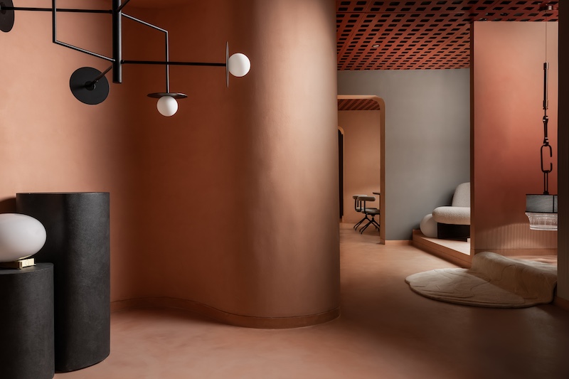
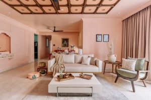
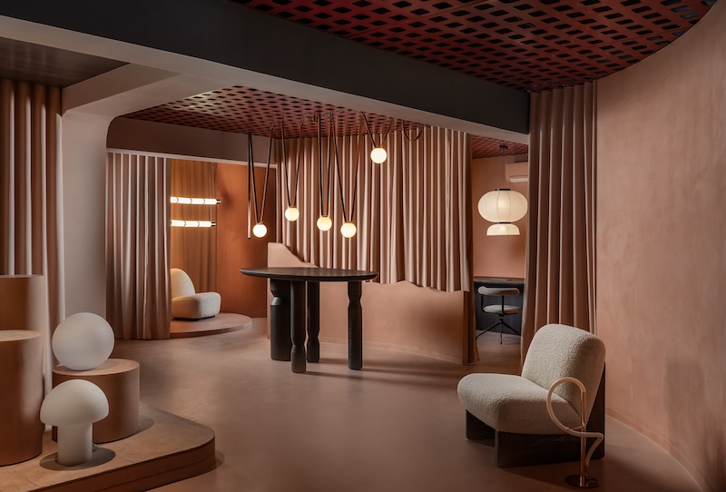
There is an instant sense of expansiveness, thanks to the peach volumes that engulf the store. “An understated elegance blending with warm minimalism served as the foundation for the store’s concept,” Studio Ruh’s design team Sayli Khadilkar and Pavitra Krishnamoorthy elaborate. The walls finished with a slight texture weave sinuous movements and softened corners under one roof, while smooth micro-topping flooring in the same peach tone creates a cohesive visual impact. With just the right amount of tactility and movement, the result is still minimalist to permit every one of Prism Lights’ offerings to shine.
An intelligent metal ceiling system finished in duco allows for the clever concealment of cables and for lights to be suspended. Finally, matte black natural wood tables by Creatomy sit in pleasant contrast to the monotone surrounds of this highly minimalist peach shell. Seating zones furnished with Creatomy’s bouclé armchairs encourage moments of reflection. The new Prism Lights store in Bangalore is where lighting solutions are brought to life in a serene space that blends understated elegance with warm minimalism for a retail experience that’s far over-overwhelming.
Also read: How Five Helical Staircases Make An Architectural Impact In Urban Settings
#2 A Marriage of Tradition And Modernity, Qbik by AMPM Designs
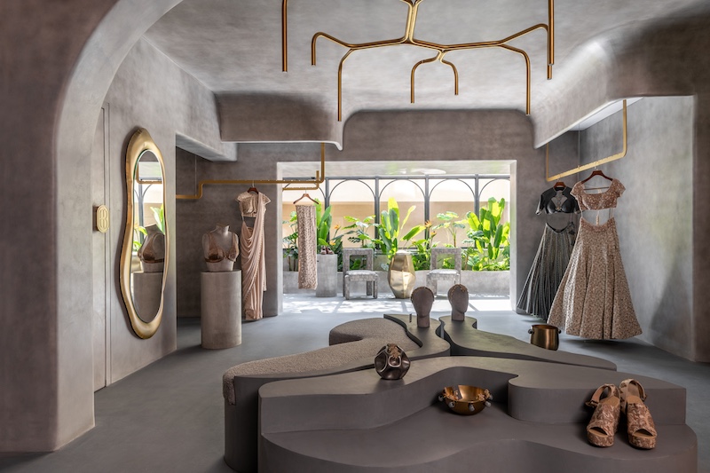
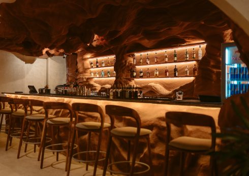
The two-storey flagship store of Qbik in Hyderabad is housed within a former residential structure, given a new lease of life by designers Akash Mehta and Poonam Mehta of AMPM Designs. The Delhi-based label by designer duo Vrinda Sachdev and Gurinder Singh celebrates the profusion of India’s magnificent crafts and colour palettes through collections for men and women. Their latest store not only underscores Qbik’s fusion lines and groom’s wear; it also masterfully distils Hyderabad’s natural heritage of ancient rock formations into a retail space replete with ethereal charm. The designers at AMPM Designs draw from the concept of a conservatory to allow for the minimalist space to soak in the superabundance of natural light and lush greenery.
Also read: Explore Modern Workplaces In India: Japandi Minimalism, Biophilia, And Beyond
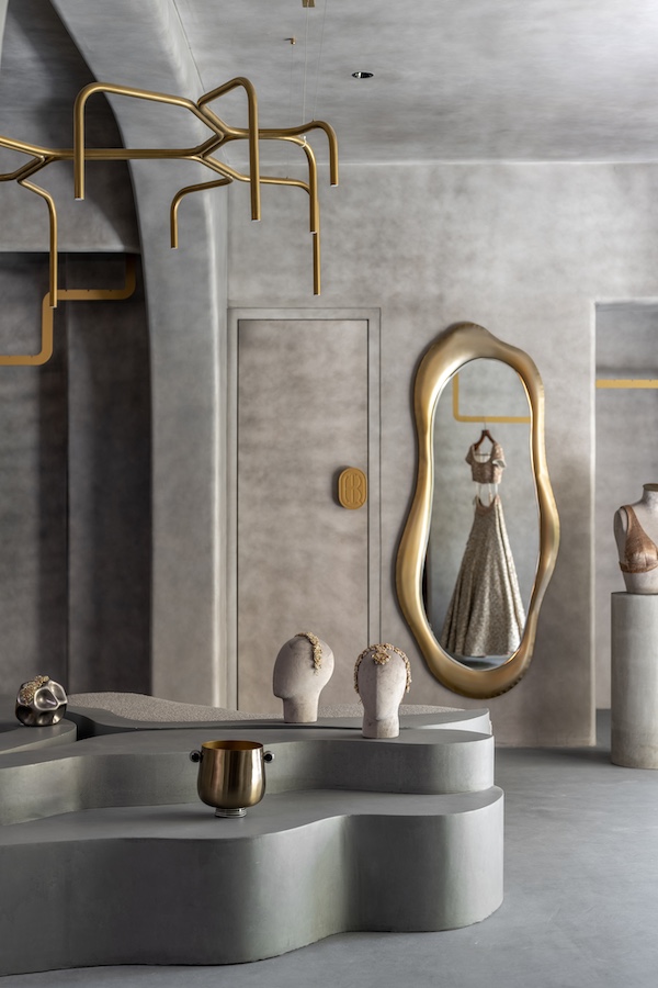
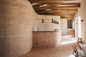
Taking cues from brutalism, micro-concrete floors merge with store walls, textured to resemble stone facades but smoothly finished for a sense of contemporaneity. The 3,500-sq-ft store came with low ceilings and a multitude of columns. This hurdle was overcome by inserting a column-to-column curved detail so seamless, it appears to be part of the structure. This thoughtful detail in spatial planning creates a flow as one moves across various ranges on display, as do fluid display racks suspended from the ceiling. Minimalist and fluid wall shelves crafted from ply and MDF, painted in the same cool-toned finish as the store at large, appear to organically flow from its walls all the while permitting every piece of fashion to shine. Under the Branch Light chandelier by Hatsu is a cluster of fluid accessory display pieces crafted from wood and poured with micro-concrete material; one of the pieces in this cluster is a seating space upholstered in grey bouclé fabric.
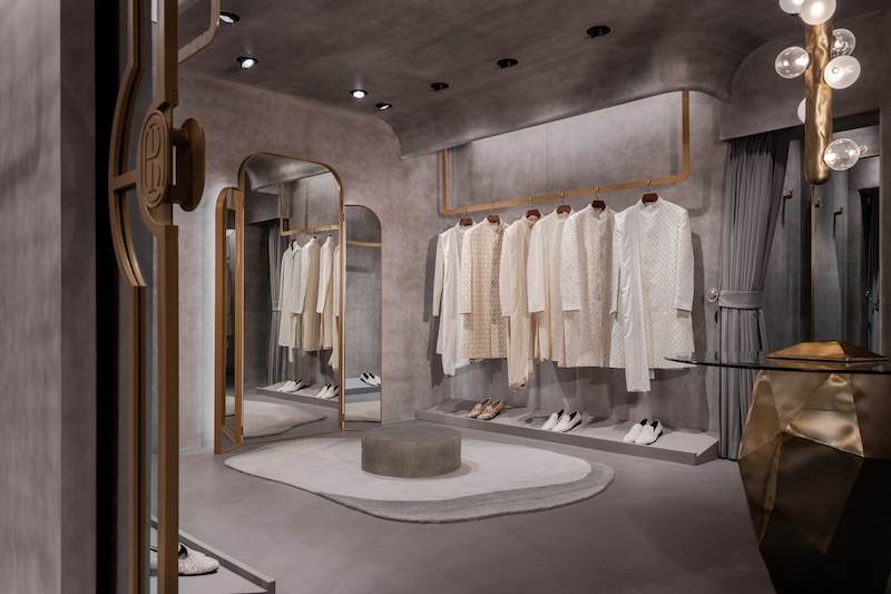
Bespoke furniture and statement lighting pieces are the only real embellishments against the otherwise minimalist backdrop of the store. Metal-crushed leg pouffes cushioned with fur and glass-topped coffee table bases by Nitush-Aroosh are striking allusions to the store’s rock-inspired aesthetic. The collaboration with the design studio, adored for its masterful manipulation of stainless steel into sculptural furniture and objects, extended to a bespoke version of much-loved pieces like the Lasso irregular mirror in the main store and a smaller version of the Molecule Lamp in the groom salon.
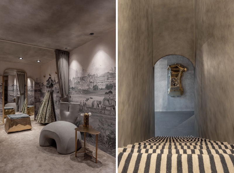
Kalakaari Haath’s Sabr wallpaper with hand-painted motifs of monuments in erstwhile India supplies a plush and regal touch to the exclusive trial room. Paired with Hatsu’s grey bouclé furniture, the tone-on-tone look is pulled off to a tee. Punctuating the raw architecture of this store is a black-and-white striped carpet runner, custom-made by Jaipur Rugs. Besides the tone-on-tone aesthetic, stripes are another signature Qbik design element that adds to the immersive experience of shopping the traditional-meets-contemporary label.
#3 An Old Store Given A New Lease Of Life, Almaari by Neeran Designs
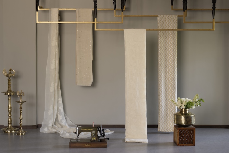
Almaari by Pooja Patel is a Surat-based brand that fuses traditional Indian craftsmanship with a modern aesthetic. Initially designed in 2021, the store recently underwent a transformation that not only revitalised the space but also led to the expansion of its carpet area to 585 sq ft. One of the main goals of the redesign was to reuse many of the resources still in good condition. This was done to maintain a sense of similarity between the previous and current design, thereby encouraging familiarity. Zinal Mehta, principal architect and co-founder of Neeran Designs, was entrusted with creating a space that would effectively showcase Almaari’s womenswear while retaining the aesthetic of the brand: traditional through a contemporary lens.
The redesign of the store began with an entirely new insertion. A new vinyl flooring with a rustic semi-matte finish replaced the old, damaged flooring. Then, a revised colour palette took shape to complement the rustic cement-finished flooring. Darker shades of wood now harmonise with grey and brown tones, while copper orange, tan and gold accents infuse the space with a sense of richness. To ensure a consistent ambience and retain a sense of familiarity for returning customers, existing tables and displays were creatively repurposed to ensure seamless integration with the overall design scheme.
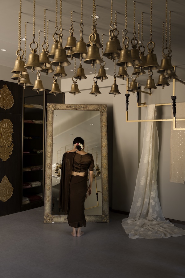
The designer’s table from the previous space was repurposed as a reception table with a new plywood panel extension. A lofty mirror also returned to the newly designed store, now repurposed with a decorative decoupage trimming. A cluster of brass bells from the previous store, crafted in a temple shikhara style, were rearranged to cast a more dramatic effect.
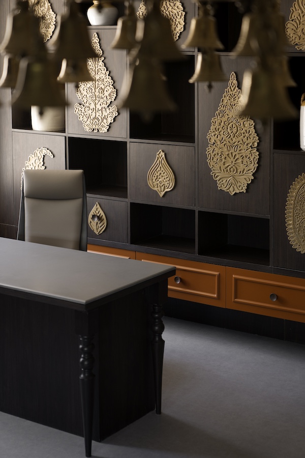
Mehta and the team also added a storage compartment behind the designer’s table to store fabric. Much like a see-through almaari of sorts, the display with multiple levels of varying heights allows for fabrics to add to the visual appeal of the store. A designer’s table with a scratch-resistant 15 mm solid full-body colour tile top with chamfered edges was crafted anew to replace an older table more prone to scratches. A series of wall-mounted elements crafted in MDF from the previous space was reused, this time on the concealed storage areas that effectively create a decorative backdrop for the designer’s table. By cleverly repurposing the old, Neeran Designs has effectively retained the familiarity associated with the fashion brand, all the while throwing light on its keen interest in the revival of near-dying crafts.
Ultimately, these three retail spaces define the in-store shopping experience through store design that’s functional and immersive.

