This Apartment In Lokhandwala, Mumbai Tells A Story Through Geometry And Texture
In the residential nucleus of Lokhandwala, Mumbai lies an apartment where strong geometric forms, rich textures, and unconventionality of processes come together to reveal a shining example of contemporary design. Smita Thomas, principal designer at Bangalore-based Multitude of Sins (MOS) rose to the challenge of remote design, conceptualizing and executing the project over the series of pandemic-induced lockdowns across the country. The clients, who were well-acquainted with the studio’s design sensibilities, desired a space that was modern yet timeless, dominated by neutrals. “A colour scheme of monochromes dabbling in black, white, and grey, along with accent hues such as sage green, aquamarine, and a sprightly vermillion came to life,” says Thomas. Add to this a superbly layered selection of materials, an uncompromising attention to detail, and a hint of whimsy in this impressive apartment for a family of four.
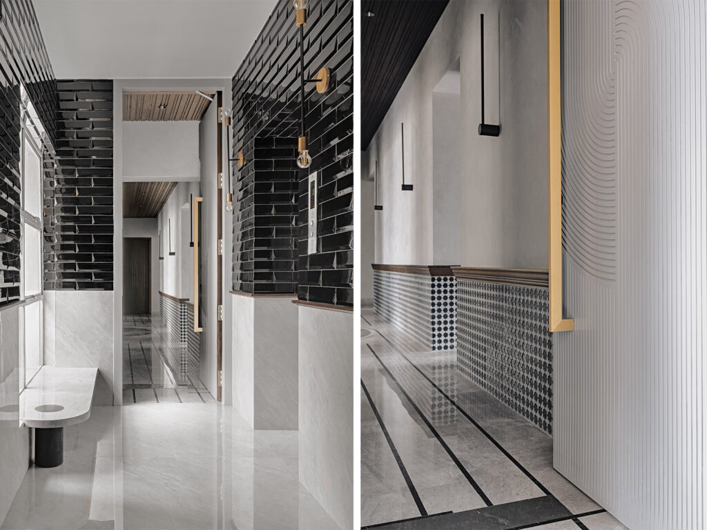
Right from the outset, the home promises intrigue. Minimalist and doused in the timelessness of monochromes, the foyer’s bipartite wall is clad in black subway and light grey marbled tiles, segregated by a dark wooden beading detail. Appearing almost as an extension of the marble wall, a curvilinear bench sits by the light-flushed window. Brass and black metal dual-armed sconces from Black Steel add a hint of industrial to the otherwise contemporary space. A cool white entrance door engraved with concentric patterns leads into the passageway. Here, one sees a leitmotif of the evolving flooring, an “embedded carpet of sorts” comprising geometric patterns created by merging natural stone and segments of wooden tiles. The walls are clad in a tessellated stone tile, tying them into the larger geometric narrative. Minimalist linear wall sconces from the The White Teak line the passageway.
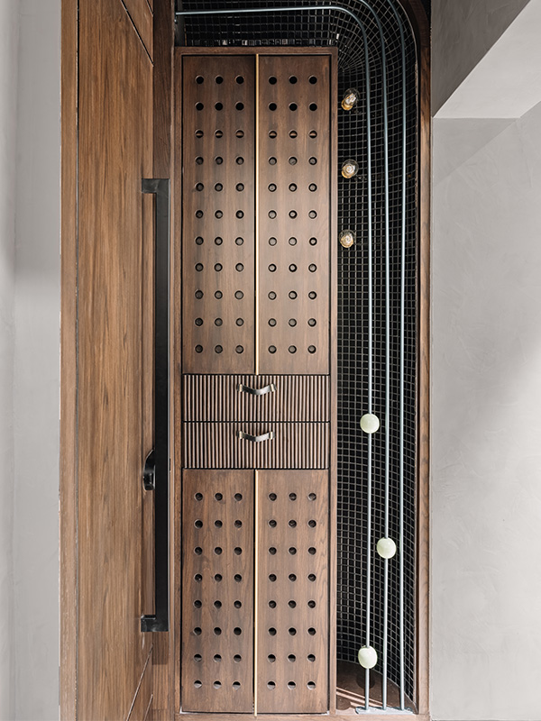
Curiously enough, one of the more remarkable elements of the space is the otherwise unassuming shoe storage! Integrated in an inconspicuous nook as a part of the passageway, the storage is immersed in a bevy of details. Wooden shutters featuring a circle-speckled ventilated front and brass elements, within a double-curved backdrop of crackled ebony mosaic create a compelling element of drama. Spheres and bulbs that seem to levitate weightlessly, add to the charm of the space.
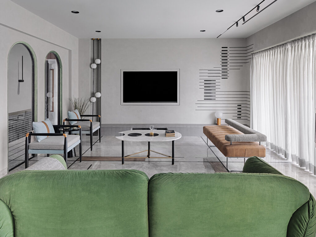
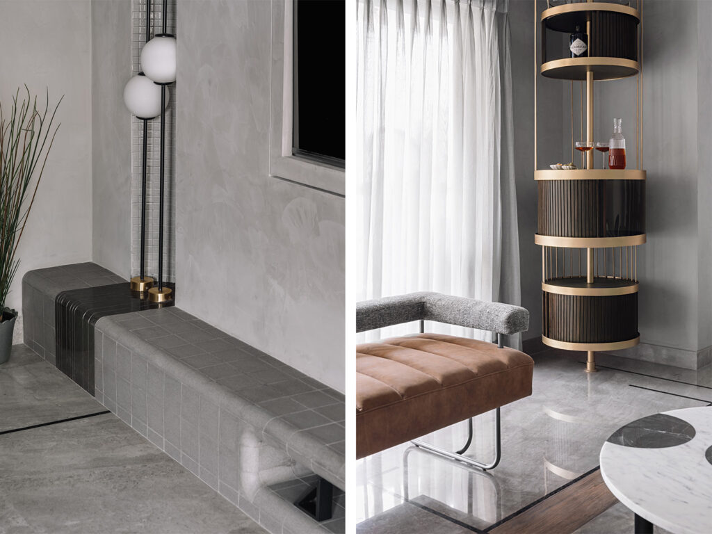
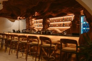
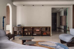
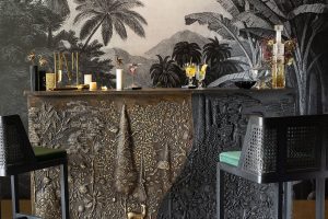
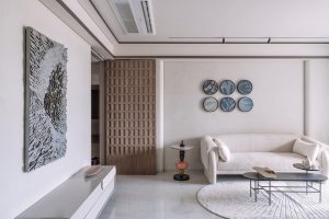
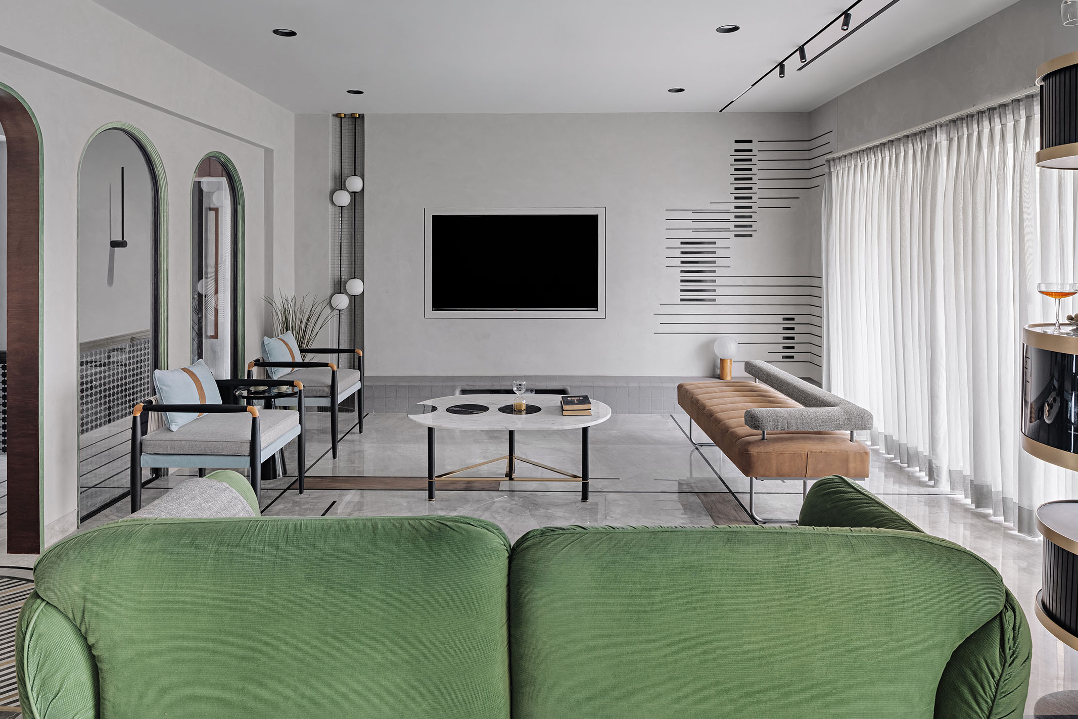
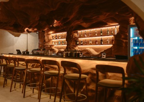
An arch-filled wall leads one into the living area where the philosophy ‘less is more’ shines through superbly. The cool neutral tones in this grey-washed space are complemented by accents of colour. An olive green sofa, grey and powder blue armchairs from Alankaram, and a taupe and grey open-back sofa surround a contemporary, monochrome coffee table from Bent Chair. A unique addition to the space, the television console comprises a curved grey tile ledge that spans the breadth of the peripheral wall, custom-made by Topcer Tiles. Furthering this narrative, a culled-out section of the wall on the left is clad with grey mosaic tiles and fitted with a lighting installation. Tucked away in a corner, the standalone bar designed by the studio itself conjures images of an underground cabaret.
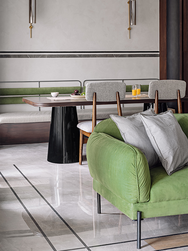
The open-plan dining area features a high-gloss black-legged and wood dining table, a customized upholstered bench on one side, and mid-century modern chairs by TeakLab on the other. Accentuated by a pair of gooseneck wall sconces from The White Teak, the dining area appears as a seamless extension of the living room. Speaking on the motif of lines that run throughout the space, Thomas tells us, “At MOS art refuses to be shackled to its association with just paintings, objects, and sculptures. In this case simple yet straightforward black lines translate into art, paving its way across furniture, walls, ceiling and floor in the form of inlay. It’s been more of an idea, a concept, a composition that elevates something banal and helps unveil just what potential a home can bear if one remembers to dismiss the notions of familiarity.”
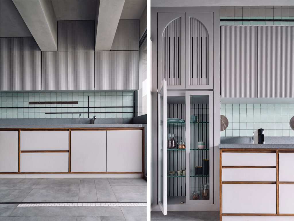
Minimalism and industrial design come together in the kitchen which displays hues of pastel aquamarine and grey, warmed by wooden details. The space carries forward the geometric language that underscores the design of the home, and presents it in the intentional segments introduced within the grey cement tile flooring, and across the backsplashes of the counters. A built-in crockery vitrine finished in black acrylic and grey PU adds a delicateness to the kitchen.
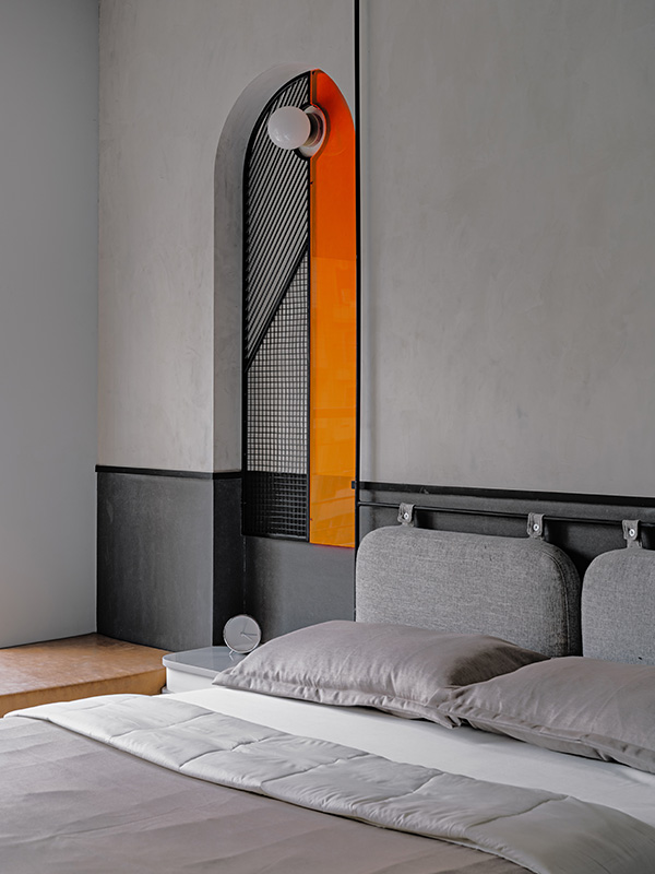
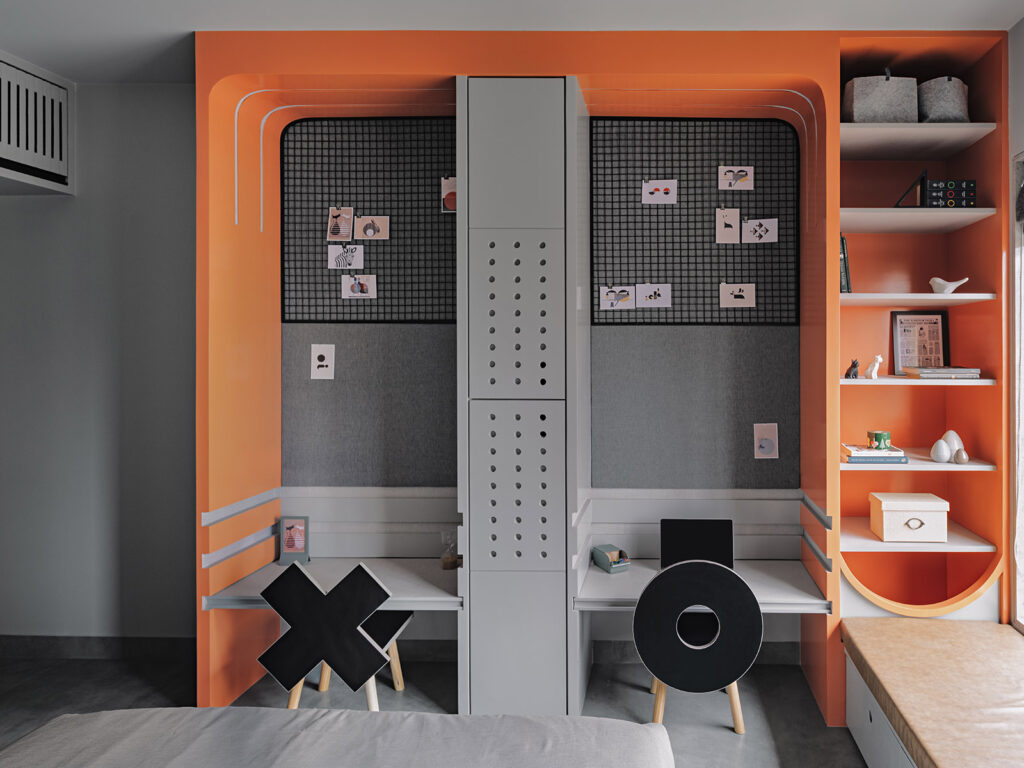
A palette of greys injected with a bright vermillion orange – the children’s bedroom is experimental and chic. The dual-toned wall anchors a sleek metal bar from which the upholstered headboard is suspended, connected to metal members that harness onto the ceiling. A shared study nook complete with all the essentials required for productivity has been designed to remain functionally adept even as the toddlers grow. Adding a sense of whimsy to the space are the ‘X’ and ‘O’ chairs by Boingg!.
All in all, simplicity and humble geometry backed by a singular vision manifested in what Thomas and her team have dubbed ‘Project Ironman’, a name that they felt playfully defined the residence.

