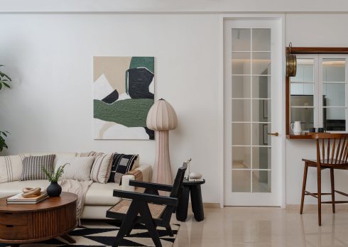
This Three-Storey Residence In Surat Is Designed For Multigenerational Living
- 9 Sep '21
- 6:29 pm by Beverly Pereira
Multigenerational living systems have well endured the test of time, and with good reason too. Homes well adapted to the individual needs of more than one generation can ease the stresses that come with child care, prevent isolation of the elderly, renew familial bonds and save natural resources and expenses. This way of living has become especially advantageous in the pandemic. For the past year, many who were once empty nesters went on to purchase homes out of the sheer necessity and convenience of accommodating aging parents as well as the return of grown children or the boomerang generation as they are called. Naturally, with everyone under a single roof, the unique requirements of an intergenerational family — privacy, accessibility and identity — need to be factored in. This is where the role of thoughtfully designed private and social places at home really comes into play.
The B.A.D (Bureau of Architecture and Design) Studio was recently tasked with the design of a three-storey row house that pays heed to the needs of three tiers of a family in Surat. The brief explicitly expressed the client’s requirement for a minimalist house with well-lit and sociable spaces for the family of five — a couple, their teenage son and daughter and an elderly parent. The 2,100-sq-ft home itself is situated in a gated community with each row house-sharing abutting walls with the next, and integrated parking spaces on the ground level with the main residence set above. Leveraging the conditions at hand, the principal designers at the Surat-based multidisciplinary studio, Alak Parmar and Boney Keriwala, designed a self-contained home for the entire family. By setting a bedroom on the first floor along with the kitchen, living and dining, they ensured accessibility and ease of movement for the grandparent. The private bedrooms of the two children find space further upstairs, while the couple’s master suite is placed on the third floor.
Arches are widely encountered across the home with the omnipresent motif carrying immense weight, in that this design element was the result of an existing building condition that would otherwise be deemed a challenge. As the project did not call for the execution of any major civil changes, the designers were left to work with niches and uneven levels between walls and structural members. Rather than concealing these niches through panelling — thereby eating into floor space — they introduced recessed arches of varying sizes. The curved form — represented as physical arches or even in customised art and other design elements — went on to inform the overall aesthetic to the extent of the home being christened the House of Arches. “During the initial status of documenting the house, we realised that the common walls between two adjacent houses resulted in the columns being nine inches thick and the walls five inches thick, which left us with offsets of around 4 inches in most of the spaces. Even though the column and beam levels aligned, it created large framed spaces within the rooms,” says Keriwala.
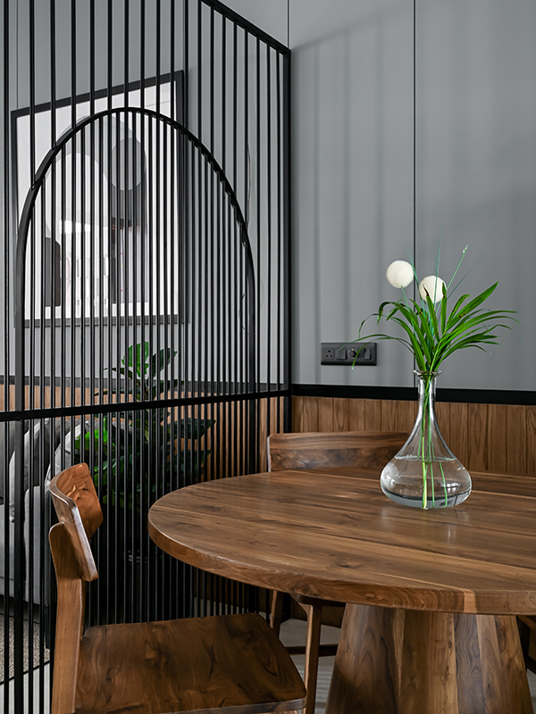
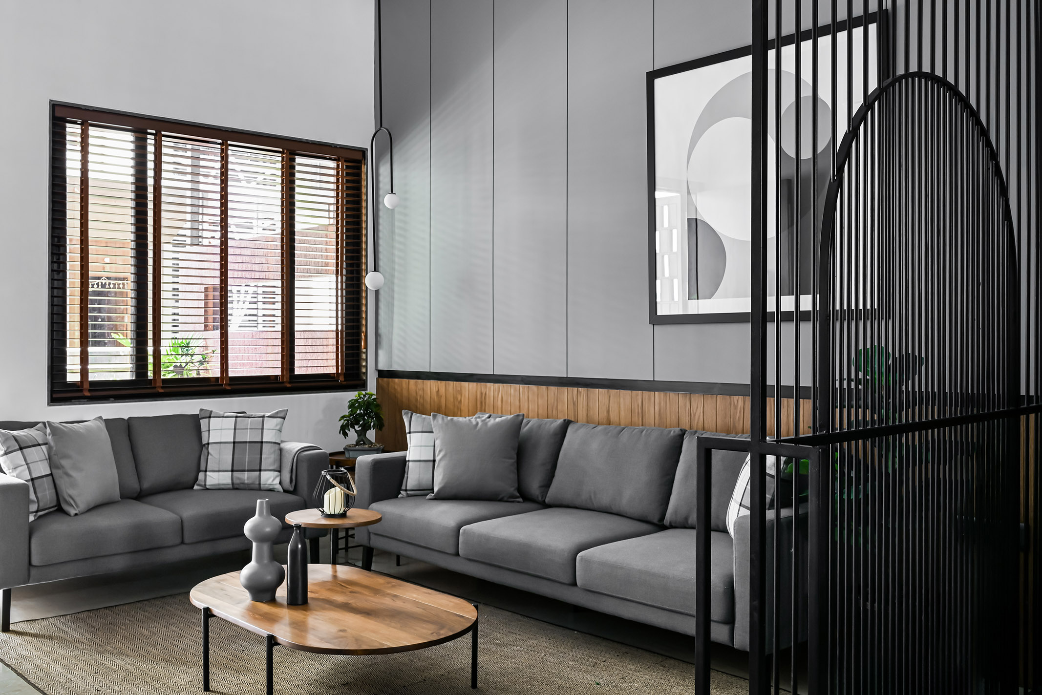
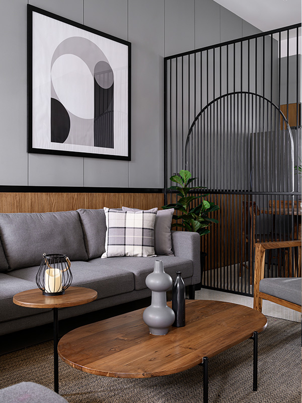
Moreover, every arch was intended to underscore the geometry of the space it graces. The dining area, for example, is an extension of the living room, save for a partition in the form of a metal arch. Serving as a screen of sorts, the silhouette of an arch set within a rectangular frame defines the specific functions of the two social spaces while maintaining a visual connection between the two. The idea, after all, was to establish a sense of openness within the house, the designers explain.
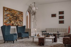
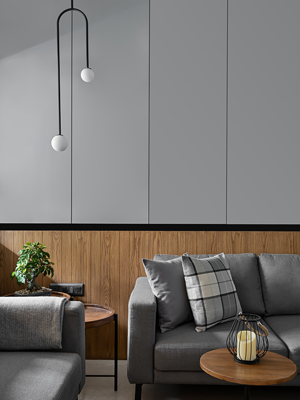
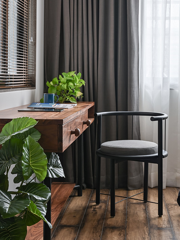
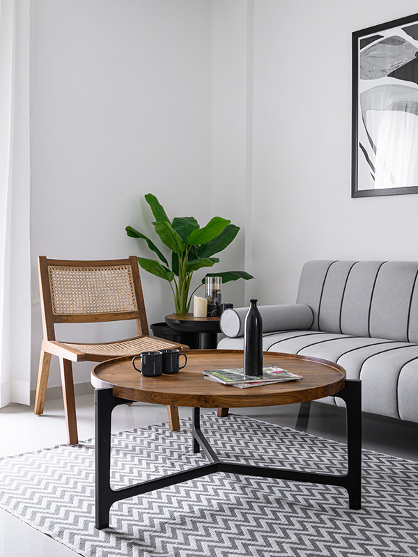
Aside from the arch motif, the designers drew from a decidedly consistent material palette of subtle textured backdrops, furnishing fabrics from Yamini and D’décor in neutral tones, wooden furniture with metal accents, and botanical-themed works of art by Studio Vartul to create a sense of uniformity. The living and dining areas come together as a whole with the installation of a sage grey and wooden finish backdrop marked by a black accent line that runs along the wall. Cool grey tones, the warmth of the wooden lounger and a centre table with side units, and green patches across the homework wonderfully against the conspicuously neutral palette. Even the entrance foyer which serves as a casual sitting area on this level overlooks a dense plantation. Visually, the grandparent’s room is in concordance with the other spaces on the first floor. Using subtlety as a starting point, the all-white bedroom is tastefully appointed with wooden furniture, including a custom-designed side table.
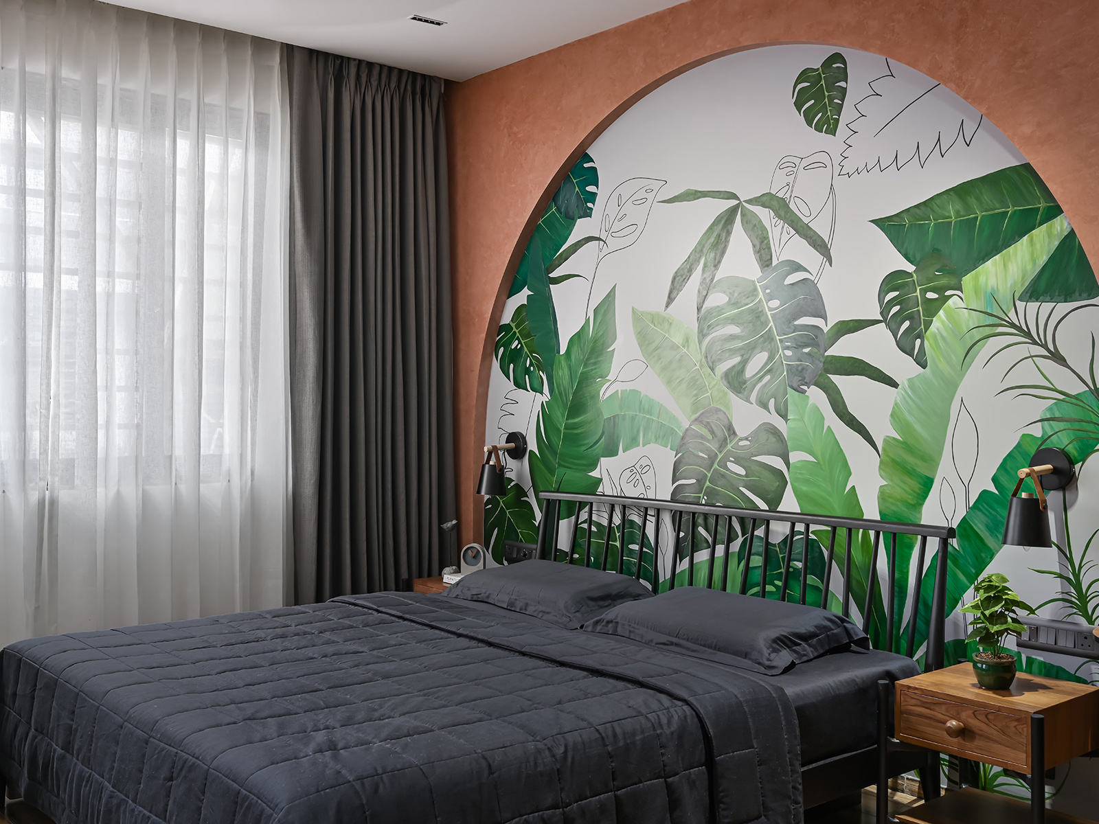
On the level above, a feature wall finished in a coral texture sets the vibrant tone of another bedroom fittingly decorated for a daughter on the brink of a transition from teenager to adult. This space carries an interesting mix of both mature and playful elements without straying away from the muted material palette of the home. The arched motif makes a return in this room — this time as a recessed arch that functions as a canvas for a hand-painted tropical-themed botanical illustration by Studio Vartul. The pared-down aesthetic by way of wooden furniture with a matte black finish and the stark grey drapes perfectly complements the vibrant backdrop, as do the scores of plants.
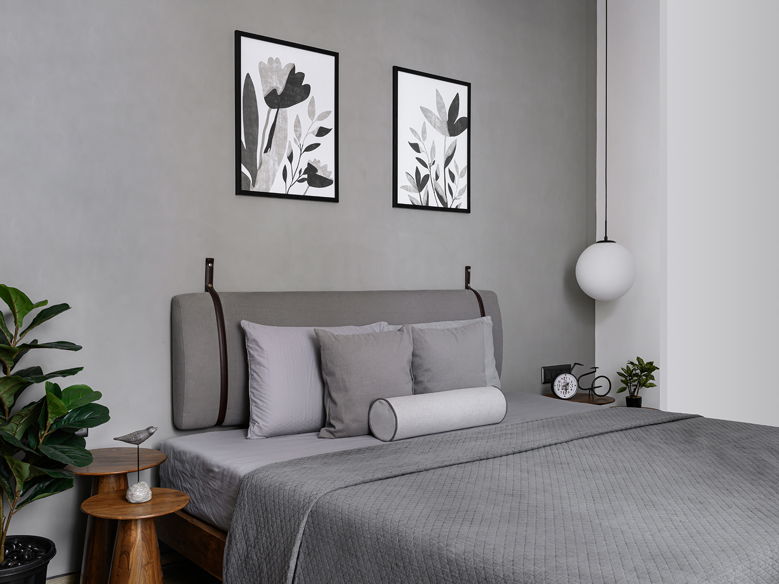
Meanwhile, the adjacent room for the son is an all-grey space with a distinctly muted and classic appeal. Cool-toned greys are at home amid the wooden bed, circular bedside tables and the occasional pops of green from the succulents and potted plants.
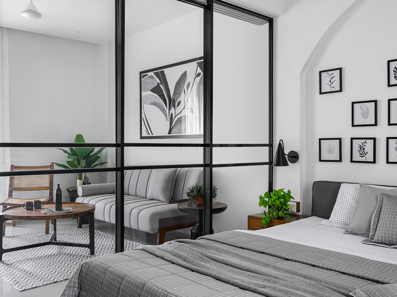
The muted palette and subtle design elements are seen across the House of Arches, as one travels all the way up to the couple’s master suite on the third floor. The recurring arch motif is also weaved into this space and is introduced as a simple segmented arch on the back wall against which the bed is set. Its soaring appearance lends this space a sense of openness, as does the glass partition that segregates the bedroom and private lounge attached to a rooftop garden. In this naturally lit space, wooden furniture and a rattan lounger are perfectly paired with the generous addition of plants.
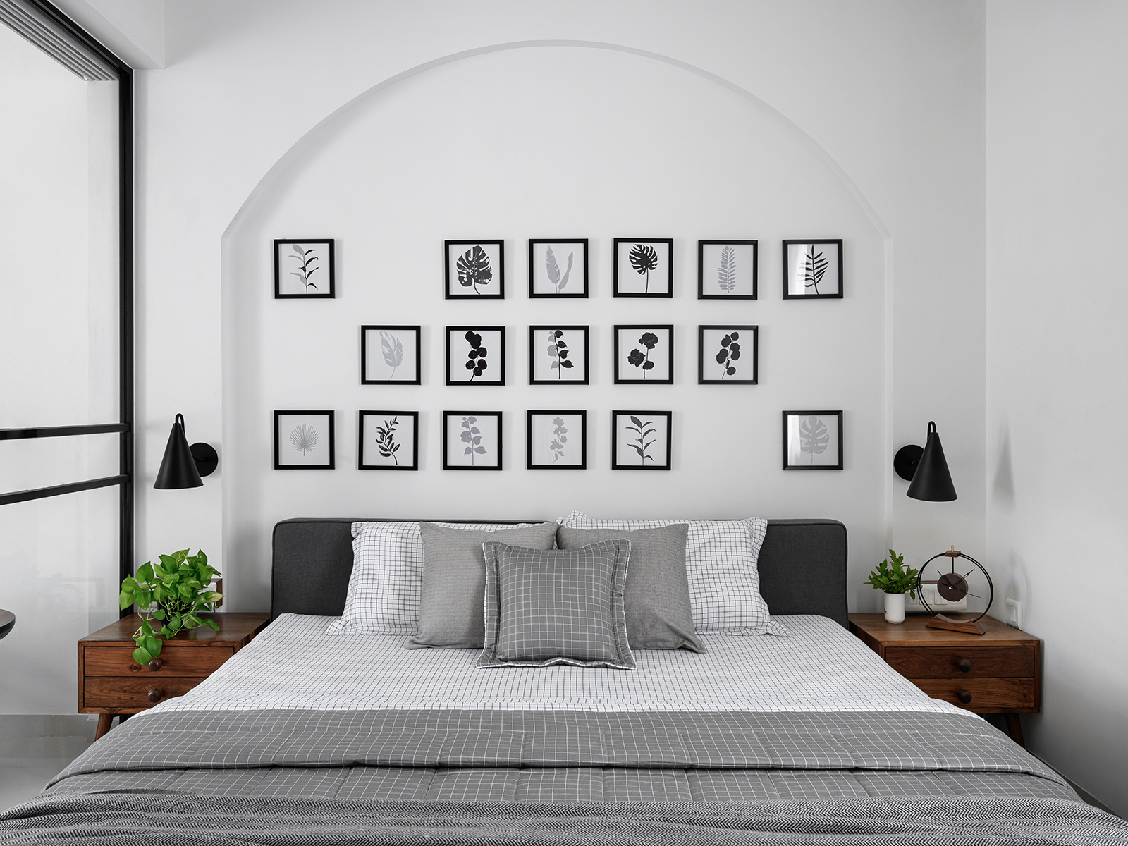
The project was a budget-friendly one, say the designers, and the furniture, plants, lighting fixtures and décor were sourced from local vendors in Gujarat. This three-storey residence pays heed to the needs of three entirely different generations and their distinct identities and requirements for both privacy and communal living. Ultimately, the home is an embodiment of a new way of living that is informed by the past.
